Descent 1 Level Recreation in Unreal 2004
- sushi.h.a.
- DBB Ace
- Posts: 65
- Joined: Tue Oct 18, 2005 2:51 pm
- Contact:
Descent 1 Level Recreation in Unreal 2004
UPDATE:
A prerelease of the map is now available for download.
See: Release page
---------------------------
Descent 1 Level Recreation in Unreal 2004
I’m not sure exactly where this should go, so I apologize in advance if it’s the wrong spot.
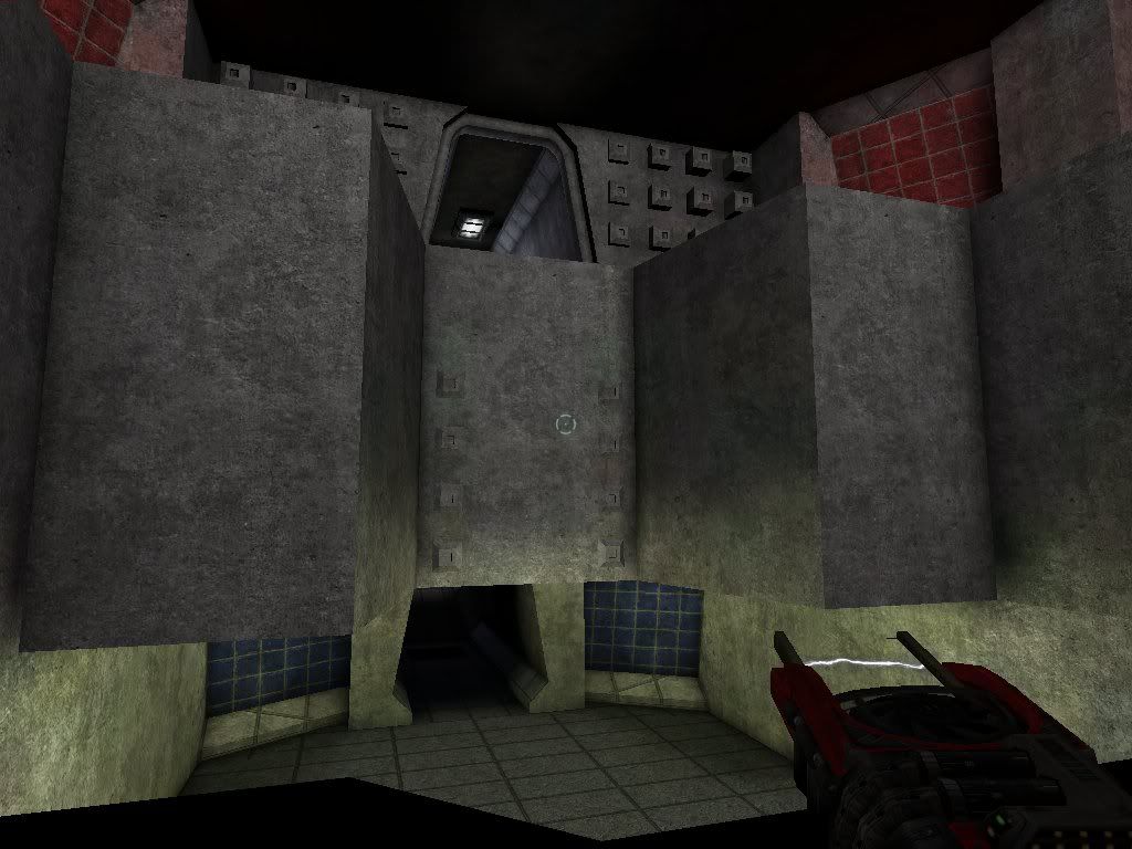
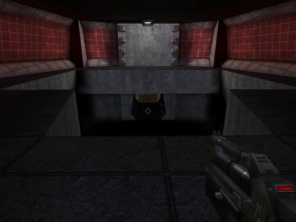
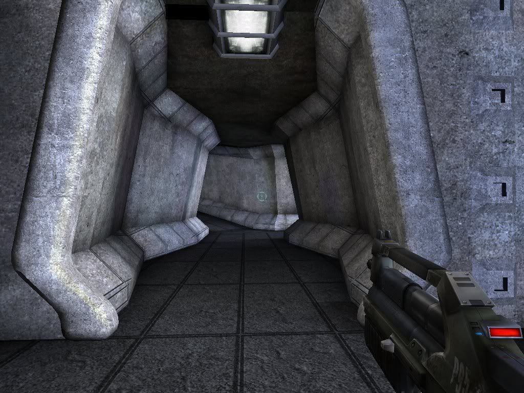
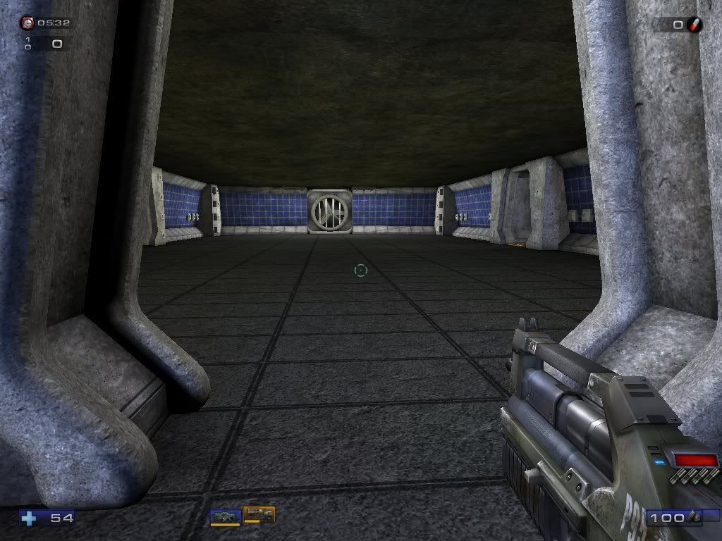
I am nearing the completion of an unreal tournament 2004 level that is a recreation of level 1 from descent 1.
The map is currently playable on foot, as it has several lifts and such, though I’m also using this map to test a descent-like 6dof mod I’m creating for ut2004 that should ultimately be usable in any map.
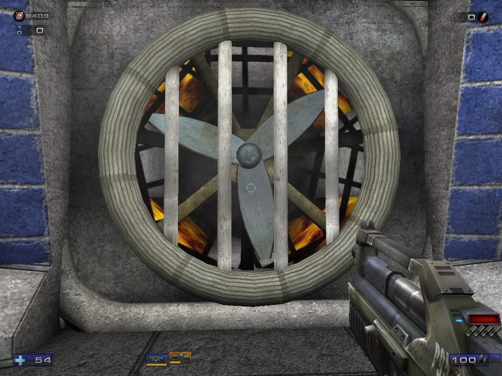
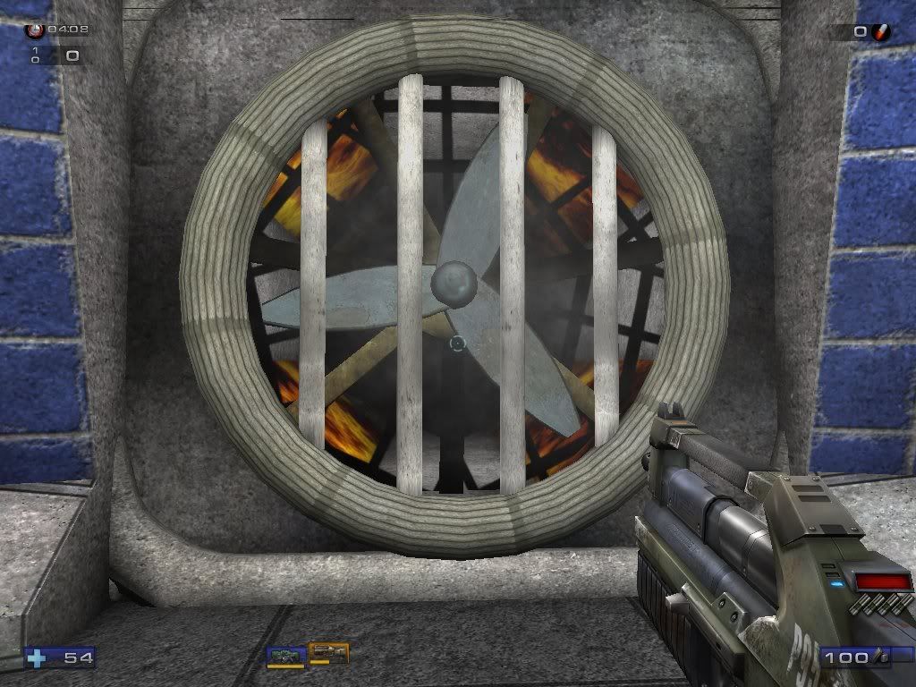
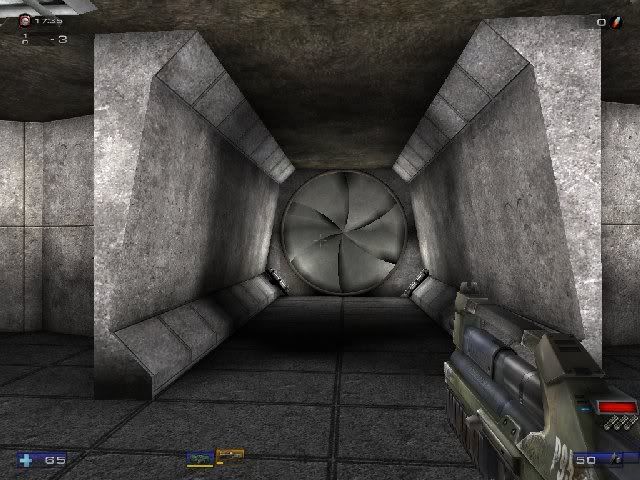
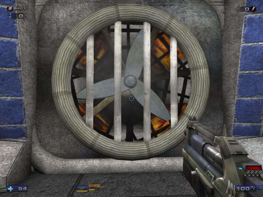
I built several static meshes for this level including the Caution Strip Bars (see image 20,21), and the fan (see image 9).
I plan to build quite a few more.
I’m also working rebuilding the original pyro, and a new pyro for the mod. The new pyro models will also eventually be used in Descent 3 GroupC, the Descent3 table mod I have already released. (of course because GroupC is a Descent 3 mod, I will use less poly intensive models. But they will still be about 5 to 10 times the normal ship poly count.)
Anyway, I’ve thinking of recreating some of the descent levels for a long time, and now having nearly completed level 1, I’m glad I did because it’s pretty cool be able to walk around a descent 1 level in high detail. I use a lot of BSP rather than just going to crazy with static meshes because I wanted the level to retain the feel of the original.
Bellow are the images of the map. Enjoy...
UPDATE:
Note: There are more recent images lower down in my later replies.
The images:
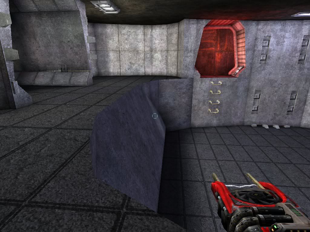
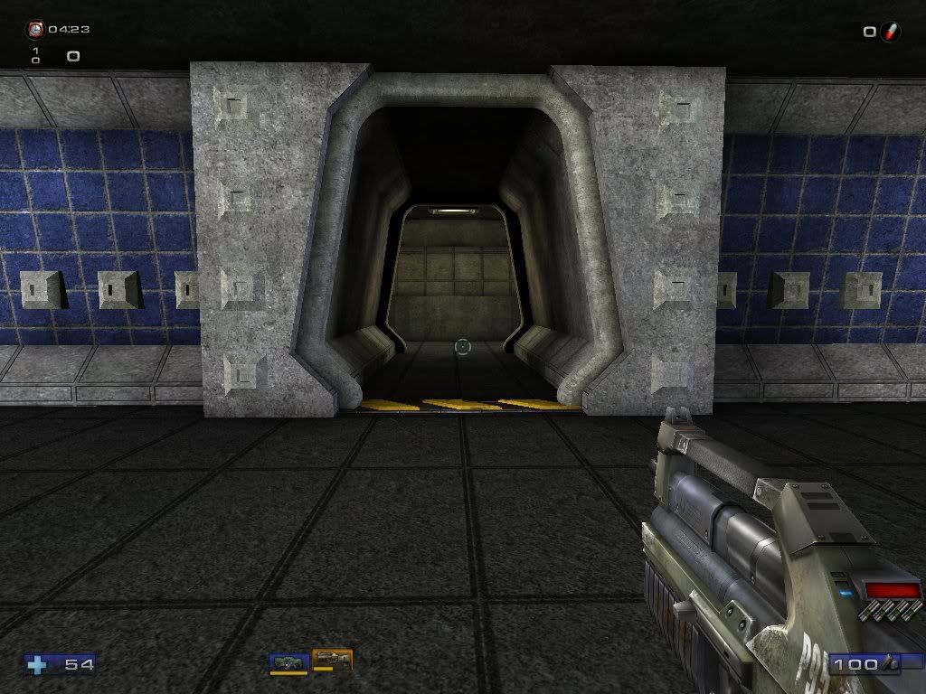
1: Starting room entrance door
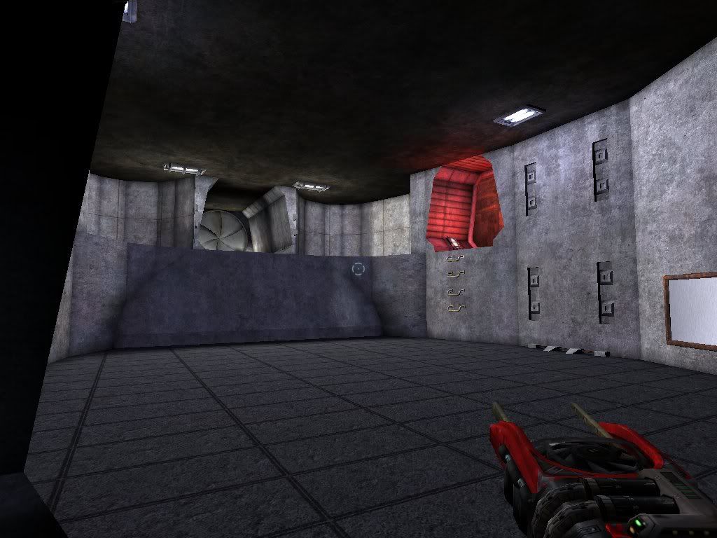
2: Starting room looking out
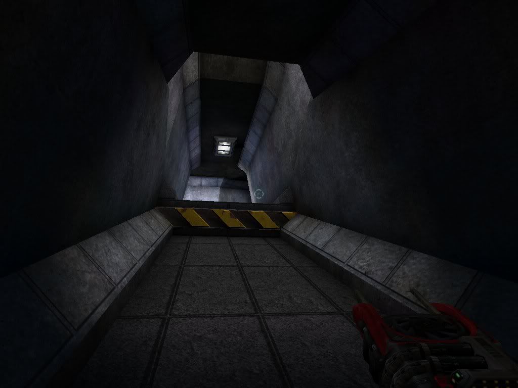
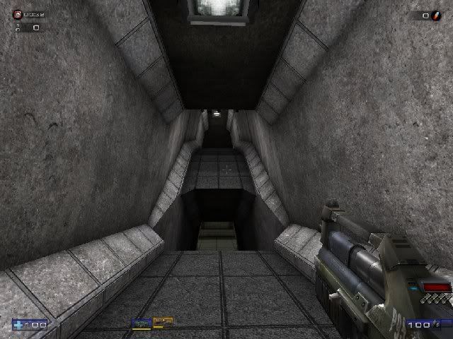
3: Vertical split Corridor entrance
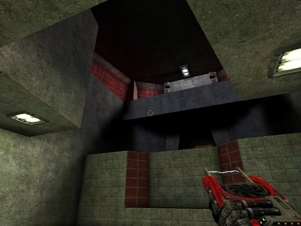
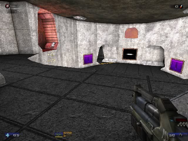
4: Red key room
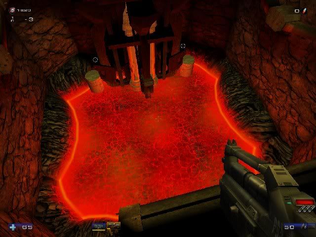
5: Red Key room bottom
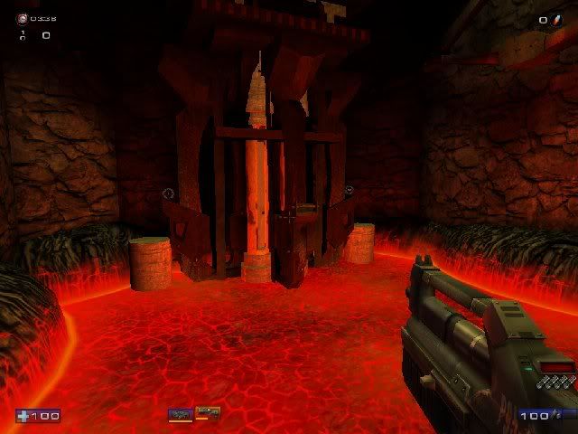
6: Vulcan room
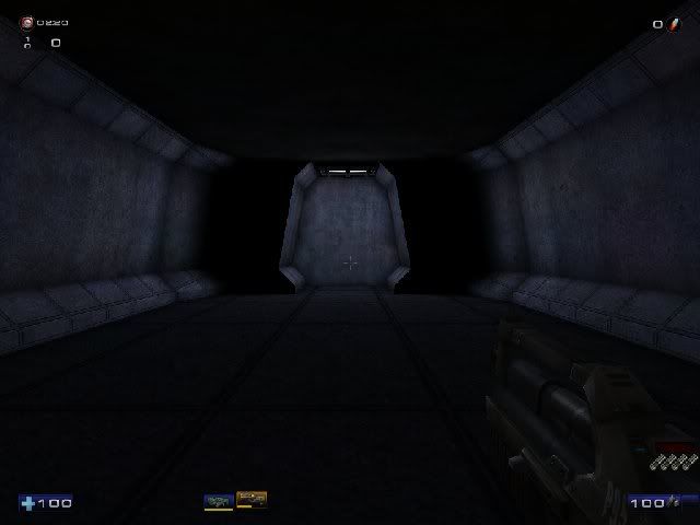
7: Vertical split Corridor return
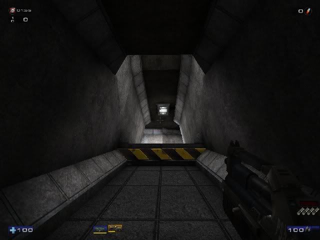
8: The fan room
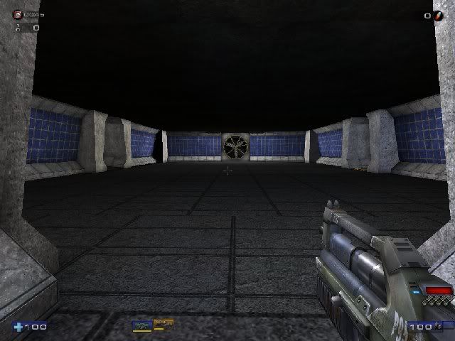
9: The fan room's fan
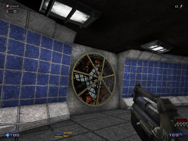
10: Energy Center
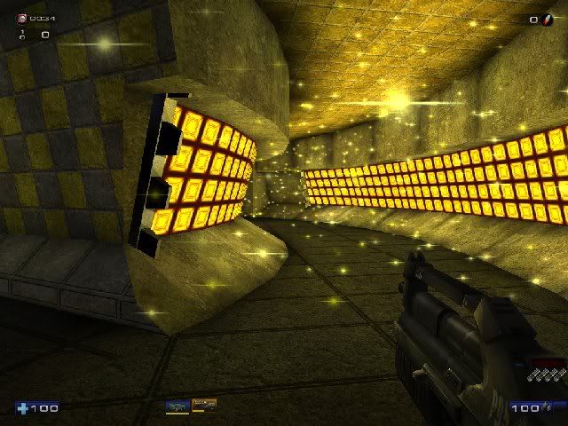
11: Starting room looking back
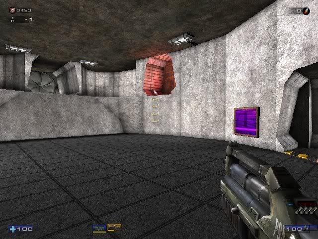
12: Drop room shaft
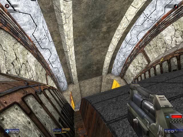
13: Drop room ceiling
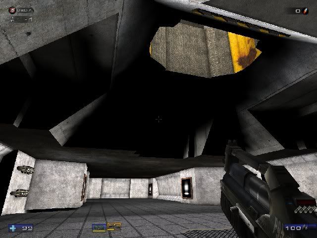
14: Drop room
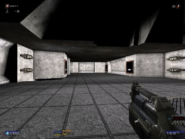
15: Drop room lower section overlooking the reactor room
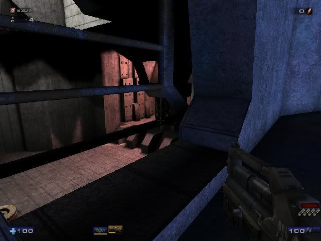
16: Drop room secret area
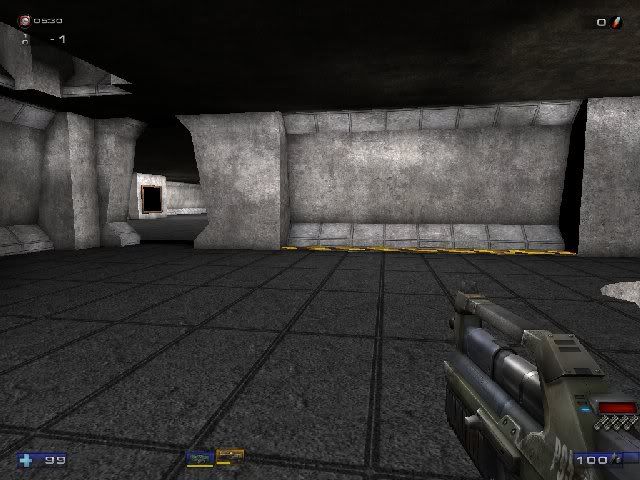
17: Drop room secret area 2
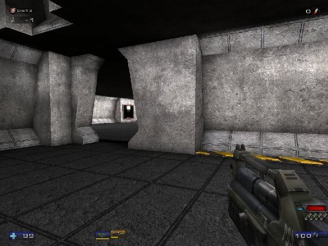
18: Reactor Corridor entrance
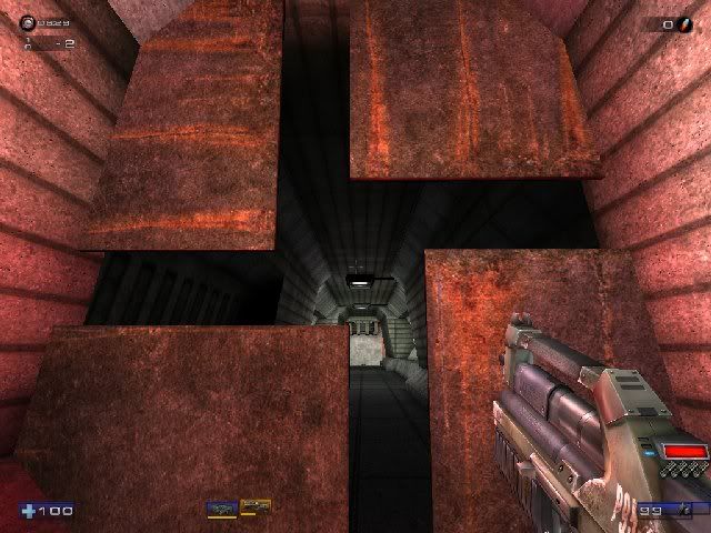
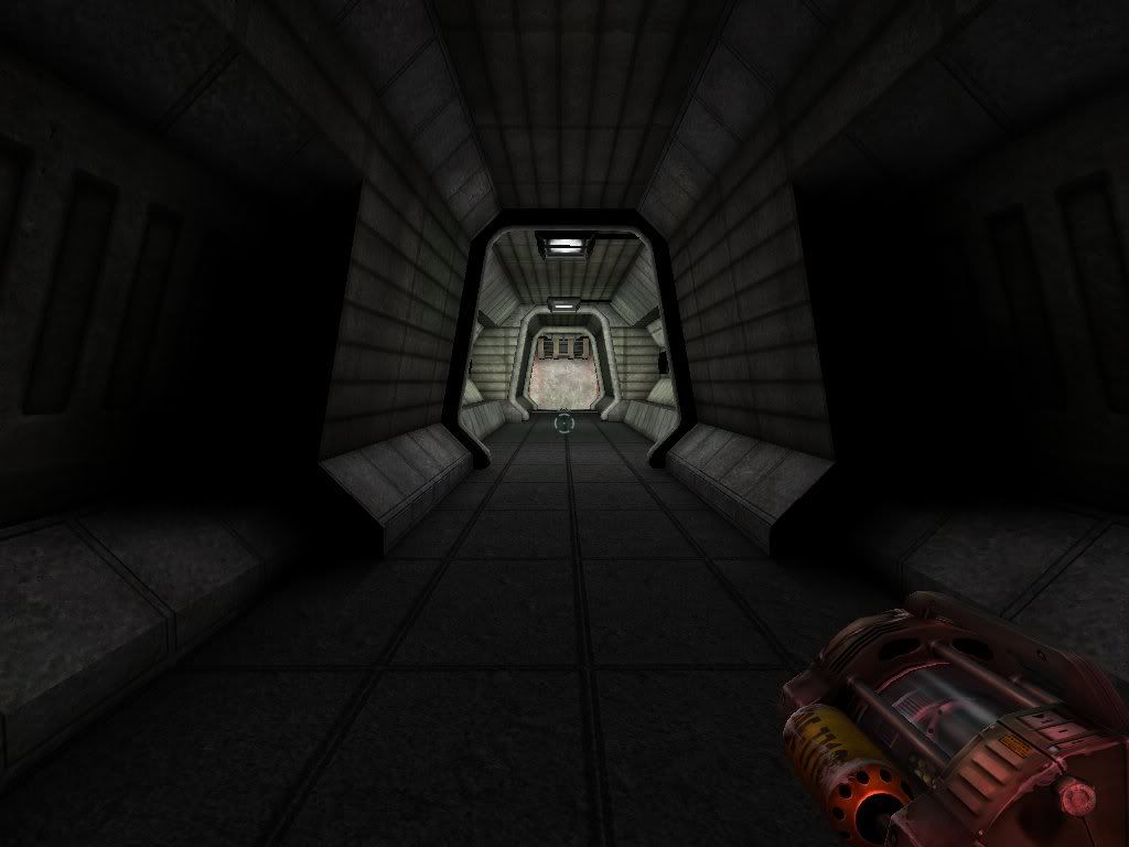
19: Reactor Corridor
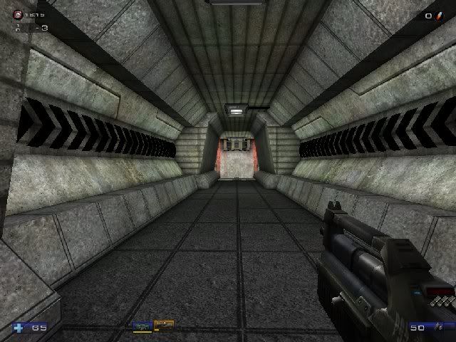
20: Reactor Corridor end
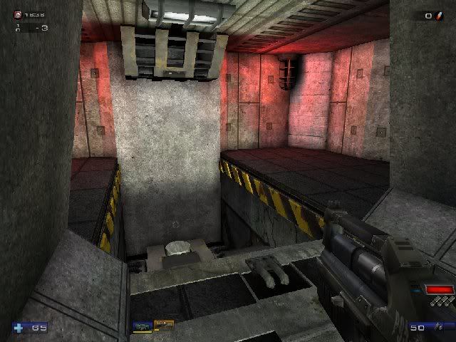
21: Reactor room drop shaft entrance
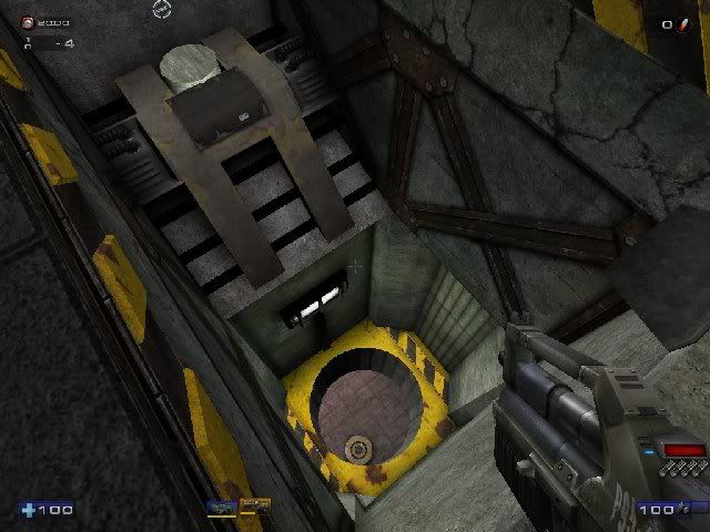
22: Reactor Corridor looking from end to entrance
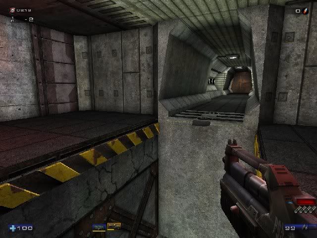
23: Reactor room ceiling
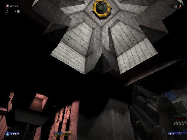
24: The reactor section from angle (Note: the reactor is currently unfinished)
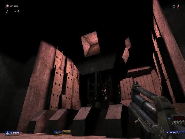
25: Reactor section from the front (Note: the reactor is currently unfinished)
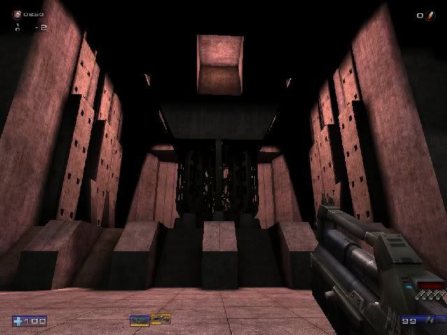
Thanks.
Take care everyone.
- CDN_Merlin
- DBB_Master
- Posts: 9781
- Joined: Thu Nov 05, 1998 12:01 pm
- Location: Capital Of Canada
- sushi.h.a.
- DBB Ace
- Posts: 65
- Joined: Tue Oct 18, 2005 2:51 pm
- Contact:
Thanks!
I hope to have the base level done soon. I will likely first build a deathmatch version, though I also plan to release an Onslaught playable version, and a Capture The Flag version. In the Onslaught version the reactor will be one of the power cores, I’m thinking I’ll place the other in the Red Key Room in the lower notch. I’ll place a lot of power nodes throughout the level, probably one per room because that way people can make whatever link setup they want, and any nodes they leave unused will be invisible during that game. I’ll release more info in a bit as I near completion of the base level.
Thanks for your comments!
Take care.
It's difficult to tell what's BSP and what isn't here. Hopefully, you're using a lot of static meshes, mainly because those octagonal corridors might provide a lot of grief if they are BSP. Watch for BSP holes.
1. You'll want to watch the lighting around the door, obviously. The door is probably a static mesh, right? Could be pretty tricky to light it correctly so you don't get the dark vertices - so don't be afraid to use some bSpecialLit lights to illuminate just the door.
2. I think this is the weakest room in the screenshots. Primarily, it's way too bright. The lighting doesn't seem to actually come from the lamps on the ceiling. Definitely considering putting some trim around the corridors too. In Unreal, trim is always a good thing. Technically, it's always good, but Unreal tends to use a lot of sci-fi trim.
3. Looks cool, although that looks like a nasty jump. You might want to continue the lower \"bumpers\" that follow the floor over the hole. It looks odd that they cut around the hole. Come to think of it, maybe try some off-white lighting too. Just because Descent was stuck with white doesn't mean you need to be. Try some subtle yellow or bluish tones.
4, 5. Niiice. This is definitely a step in the right direction. The Abaddon arch surprisingly works here. Definitely get more of that red \"up lighting\" effect from the lava. Consider adding an Emitter or two, and definitely some hazy red/orange distance fog.
6. Good color for the lights. The black spots are a bit intense though.
8. You really should do something with the ceiling here.
10. This is kind of cool looking. What function does this serve in Unreal?
12. Reminds me of one of those Piccu Station corridors in Descent 3. Too bright, but nicely detailed!
13, 14. Lighting needs tweaking here.
15. Nice that you were unable to keep this overlook here. Consider posting some kind of light source on either side of it that can cast a shadow through the vent to the opposite side.
20. The cage lights have too great a DrawScale.
22. Looks good.
23. Nice ceiling. Some more focused lighting (spotlights) will help bring this out more.
25. Consider making a new \"red veins\" shader for the Reactor room.
I don't have Kyo's eye since I am not a UT mapper, so all I can say is that it looks pretty awesome. I like the key room with the lava, the energy room, and some corridors. Some rooms look a little bland, and yes, the entry room is way too bright and looks somehow 'undecorated'.
One hint: Actually, the Pyro has the size of an airplane. Consider that when scaling your level. The guys from the Into Cerberon mod project (Descent-style Doom 3 mod) have even made a scale test for their mod to make sure everything is in proportion.
- sushi.h.a.
- DBB Ace
- Posts: 65
- Joined: Tue Oct 18, 2005 2:51 pm
- Contact:
Tragedy has struck!
Literally since I last posted the myLevel package always displays empty, and no mesh name are visible in it. (see the help post here for further details if you’re interested.)
I appreciate the further comments and suggestions. You’ll be pleased to know that the lighting color and brightness will be altered quite a bit eventually, as most of it is still over-bright from a faulty level scaler built into UE3. I will also make several more custom textures and meshes for the level. (In fact I just finished the new/original fan covering)
The faceted walls are BSP, and while I understand that they could be Static meshes, the lighting would look pretty odd on mesh walls mostly because of the linear light interpolation that occurs on meshes.
As for the red veins, I have a special plan for them... *mysterious piano music*
Thanks again. Take care.
I'd like to expound on what Diedle said. In the Doom 3 mod, the ship is a good deal bigger than the standard level as the ship model was made to scale with the human models. Thus, all mod levels have to be something like 5 times bigger than a normal doom 3 hallway.
I don't know what you have planned in all for this mod, but do consider that one thing.
- sushi.h.a.
- DBB Ace
- Posts: 65
- Joined: Tue Oct 18, 2005 2:51 pm
- Contact:
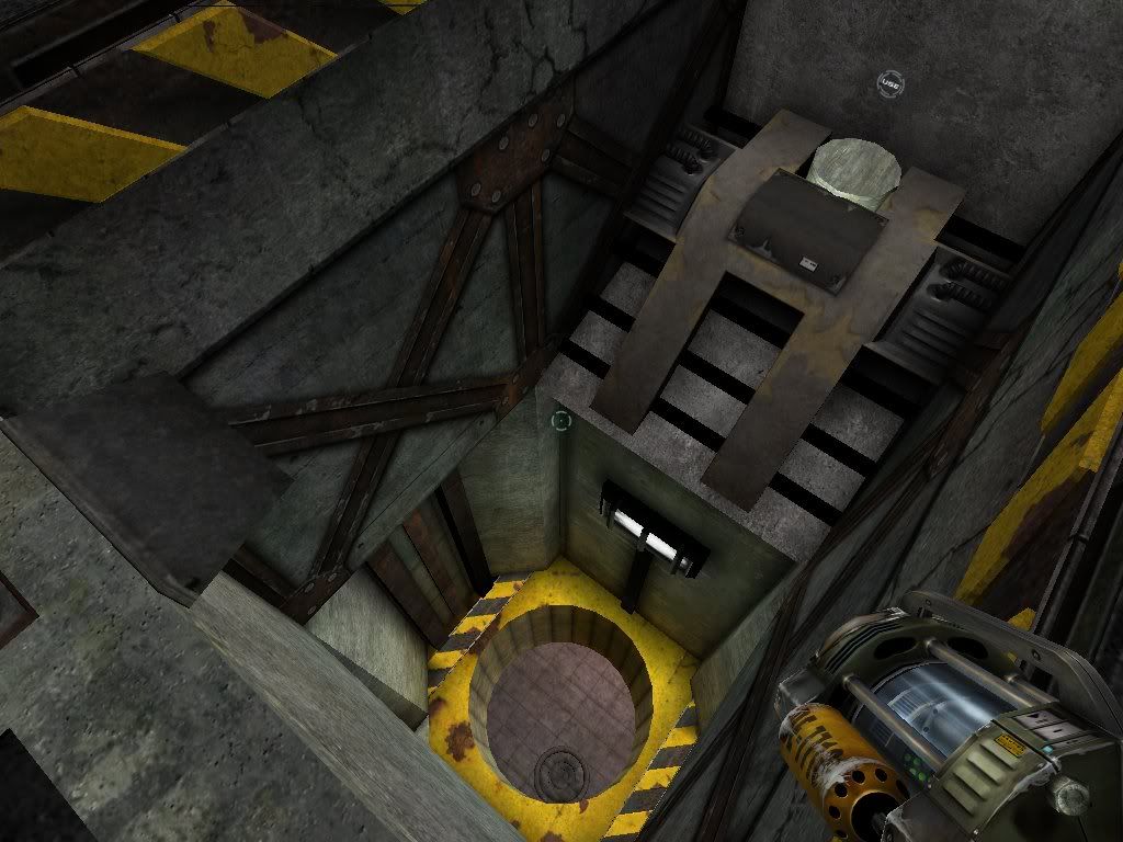
The drops all have lifts, so you can get from anywhere to anywhere else on foot. In image 21 if you look down through the shaft you can see a little circular thing on the ground. That’s a lift that can be called with a use trigger, visible in that image as a little ring touching the top left side of the of the image.
As for the ship scale in the mod, I plan to make two versions. One where the players spawn as a ship, and the ships are only as wide as a person. This way they can fit anywhere a person can, and thus any level will be playable with the mod. In The other version of the mod, players may spawn normally and the ship will be a full size vehicle.
Well, of course Unreal does \"vertex lighting\" on the static meshes, so you won't get especially great shadows on them. But finding a good balance between static meshes and BSP is important. Given what you have so far, I think DM-Compressed might be a good template to follow.
As for a corrupt myLevel package, though, I'm not sure how to recover from that. UnrealEd can get really quirky sometimes. The best advice is to just create manual backups every so often (I have over 200 clones of my Half-Life 2 map and back up the current one to a couple places ) so you have something to fall back on. I don't recall if UnrealEd 3 autosaved or not - I don't think it does.
- sushi.h.a.
- DBB Ace
- Posts: 65
- Joined: Tue Oct 18, 2005 2:51 pm
- Contact:
I have finally gotten around the bug. Fortunately I back up pretty often, but in this case I ended up duplicating the package contents, loading them into a new “clean” level then literally selecting all the actors at once and then cutting and pasting them into the new level. Everything worked perfectly.
So I’m back on track. I just finished the only portion of level I hadn’t created as of the bug. Namely the secret are above the energy center corridors. Much of the lighting has been adjusted, to give certain areas a more realistic, descent-ly, and or eerie feel depending on the location. I’ve got a few other fun dynamic lighting tricks I plan to use, (for example), to add subtle flickering effects to the static lighting in rooms. I’ve done this in some test levels and it makes the lighting feel much more real.
I’ll build a reactor mesh shortly, and I’m thinking of making a new health pickup actor that would look like the classic shield. (and if so, hopefully I’ll have time to synth an updated version of the classic sound if not just use the classic)
Hopefully I’ll have some more screenshots shortly. Until then take care everyone.
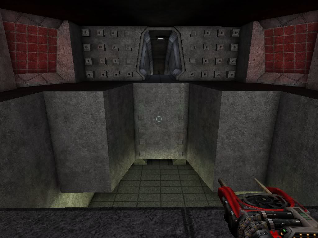
Thakns.
So I’m back on track. I just finished the only portion of level I hadn’t created as of the bug. Namely the secret are above the energy center corridors. Much of the lighting has been adjusted, to give certain areas a more realistic, descent-ly, and or eerie feel depending on the location. I’ve got a few other fun dynamic lighting tricks I plan to use, (for example), to add subtle flickering effects to the static lighting in rooms. I’ve done this in some test levels and it makes the lighting feel much more real.
I’ll build a reactor mesh shortly, and I’m thinking of making a new health pickup actor that would look like the classic shield. (and if so, hopefully I’ll have time to synth an updated version of the classic sound if not just use the classic)
Hopefully I’ll have some more screenshots shortly. Until then take care everyone.
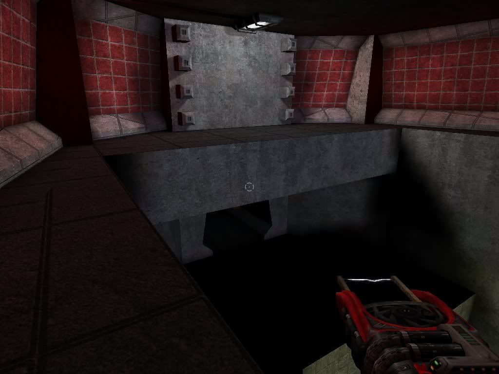
Thakns.
- Sir Sam II
- DBB Ace
- Posts: 176
- Joined: Mon May 01, 2000 2:01 am
- Location: Bradenton/Sarasota, FL USA
- Contact:
- sushi.h.a.
- DBB Ace
- Posts: 65
- Joined: Tue Oct 18, 2005 2:51 pm
- Contact:
I did notice that the functionality for several things in the editor are usable in the game, however I found a number of Interesting ways to doing things that are not ordinarily possible.
As it happens, you can place an emitter, and edit it’s light properties to make produce light. Interestingly though, it can also be made to produce dynamic light that can flicker, or be turned on and off, etc. Finally, you can replace the emitter icon for the object with the light icon and it will look exactly like a light with dynamic properties.
Though I will still likely use dynamic projectors for some things.
As always, thanks everyone!
Take care.
Re:
That's an interesting trick. o_Osushi.h.a. wrote:As it happens, you can place an emitter, and edit it’s light properties to make produce light. Interestingly though, it can also be made to produce dynamic light that can flicker, or be turned on and off, etc.
- sushi.h.a.
- DBB Ace
- Posts: 65
- Joined: Tue Oct 18, 2005 2:51 pm
- Contact:
I have a preliminary / provisional reactor model done, though I will likely modify it greatly or rebuild a completely different model before finishing the level.
I textured this model without UVing it and stuck in the level to get a feel for how it would look and what style I might want use when modifying or remaking it.
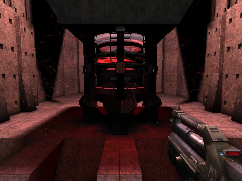
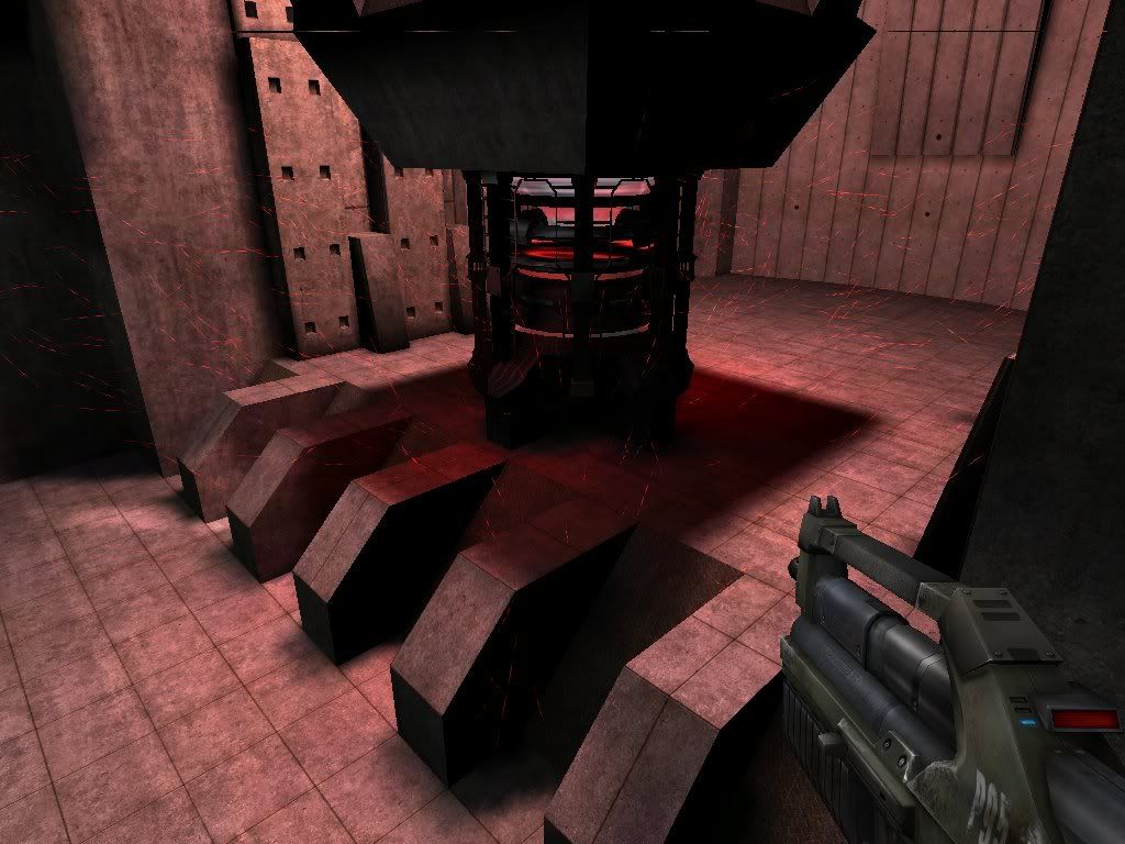
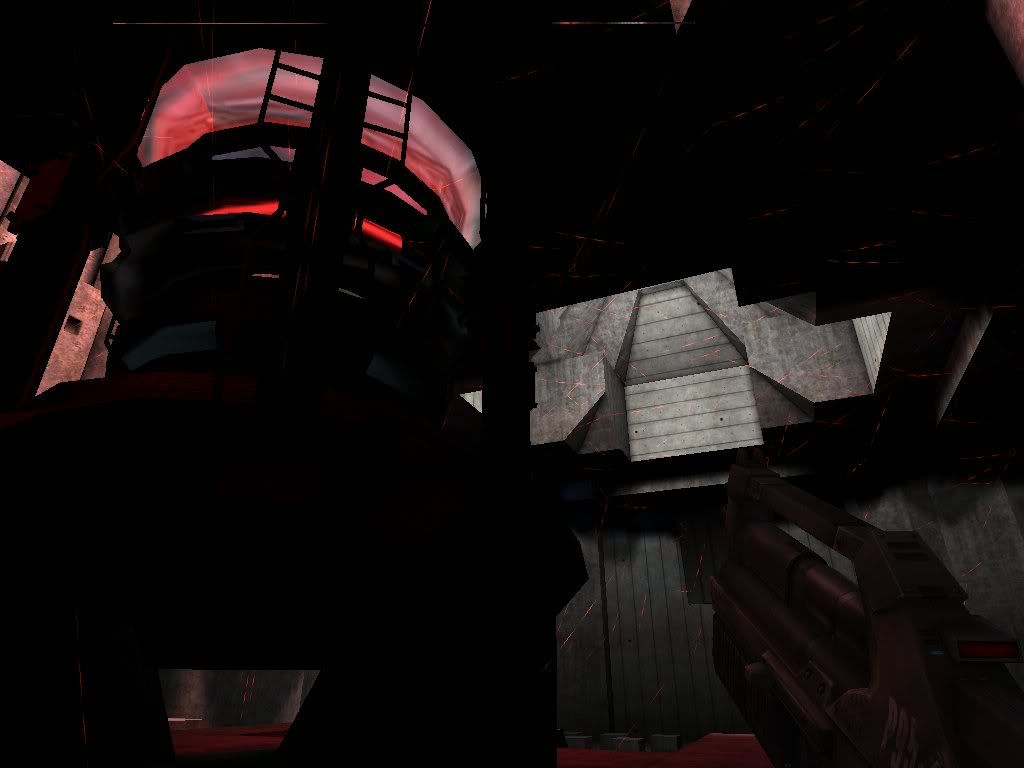
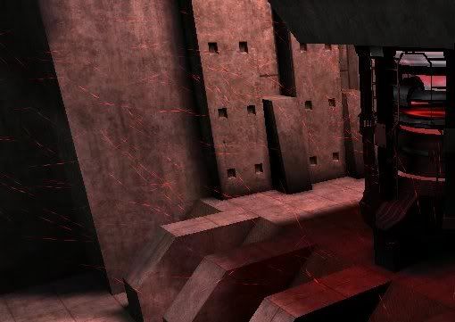
It is hard to see in the 640x480 images, but there are thousands of red streaks snaking though the air into the reactor in realtime. This is most visible in images “R2” and “R4” as the red wisps floating around the reactor.
Images:
R1: Looking forward
R2: Looking forward side
R3: Looking back from the side
R4:
Thanks everyone
- sushi.h.a.
- DBB Ace
- Posts: 65
- Joined: Tue Oct 18, 2005 2:51 pm
- Contact:
Some new (higher resolution) screen shots.
I softened up and tweaked the lighting in a lot of the rooms.
I made some new meshes for the corridors, and the fan.
Enjoy.
S3.1: The Shaft again.
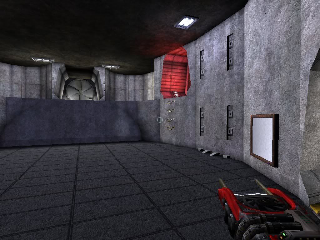
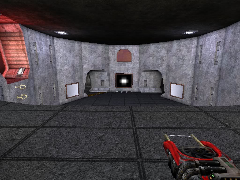
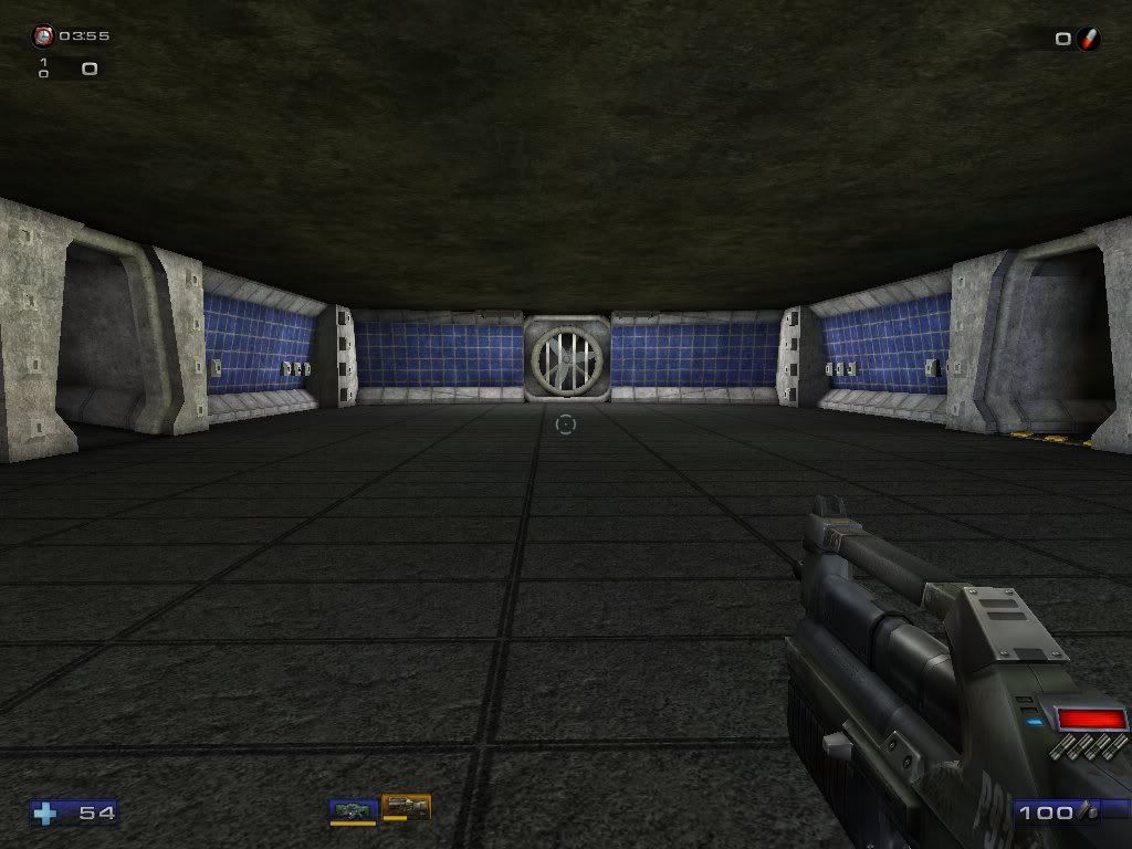
S3.2: The Main room. With softer lighting.
S3.3: The Red corridor. Now slightly extended, and with a little new lighting.
S3.4: The Main room again. The classic view.
S3.5: Main room. Red door.
S3.6: Main room. Looking out of right corridor.
S3.7: The Vertical Split.
S3.8: The Pre Red Key room. View from the bottom.
S3.9: The Pre Red Key room. View from in front of the red key room.
S3.10: The Pre Red Key room. View from the top looking backward.
S3.11: The Pre Red Key room. View from the top looking forward. I like the shadows.
S3.12: The Pre Red Key room. View from the top of the Vertical Split looking forward.
S3.13: The corner room with the hostage door. View looking towards the Main room.
S3.14: The corner room with the hostage door. View looking towards the fan room.
S3.15: Fan room. Looking towards the energy room.
S3.16: Fan room. Looking at the NEW FAN!
S3.17: Fan room. Looking at the NEW FAN! pic 2
S3.18: Fan room. Looking at the NEW FAN! pic 3
S3.19: Fan room. Looking at the NEW FAN! from afar.
I don’t know why I have 3 fan images, but I uploaded them all, so I figured I would use them.
In other news I’ve built a new lighting system for ut2004 which I will be using to replace all the current lights. I’m currently putting together a tutorial explaining how to produce the new effect. I’ll post a link to it here once I post it, just in case anyone is interested.
Anyway, thanks everyone.
Take care.
I softened up and tweaked the lighting in a lot of the rooms.
I made some new meshes for the corridors, and the fan.
Enjoy.
S3.1: The Shaft again.
S3.2: The Main room. With softer lighting.
S3.3: The Red corridor. Now slightly extended, and with a little new lighting.
S3.4: The Main room again. The classic view.
S3.5: Main room. Red door.
S3.6: Main room. Looking out of right corridor.
S3.7: The Vertical Split.
S3.8: The Pre Red Key room. View from the bottom.
S3.9: The Pre Red Key room. View from in front of the red key room.
S3.10: The Pre Red Key room. View from the top looking backward.
S3.11: The Pre Red Key room. View from the top looking forward. I like the shadows.
S3.12: The Pre Red Key room. View from the top of the Vertical Split looking forward.
S3.13: The corner room with the hostage door. View looking towards the Main room.
S3.14: The corner room with the hostage door. View looking towards the fan room.
S3.15: Fan room. Looking towards the energy room.
S3.16: Fan room. Looking at the NEW FAN!
S3.17: Fan room. Looking at the NEW FAN! pic 2
S3.18: Fan room. Looking at the NEW FAN! pic 3
S3.19: Fan room. Looking at the NEW FAN! from afar.
I don’t know why I have 3 fan images, but I uploaded them all, so I figured I would use them.
In other news I’ve built a new lighting system for ut2004 which I will be using to replace all the current lights. I’m currently putting together a tutorial explaining how to produce the new effect. I’ll post a link to it here once I post it, just in case anyone is interested.
Anyway, thanks everyone.
Take care.
Some points:
- Make sure you put some coronas on the lights. It will make them stand out more
- You should add some fog to create a bit of steamy haze throughout the mine. Change colors when you move down into the reactor room and the Red Key area too.
- The Reactor effect is clever. Use some Beam Emitters to make the Reactor seem more powerful (look at the static generators in DM-Asbestos).
- sushi.h.a.
- DBB Ace
- Posts: 65
- Joined: Tue Oct 18, 2005 2:51 pm
- Contact:
I do plan to add coronas, though I will not likely be using the corona system built into unreal 2004. (at least not exclusively) I’m planning on trying out a new method I came up with a few days ago.
I considered adding in ambient fog, and I still may, my current concern however is that fog is not lit correctly, or at all for that matter. As such, it will do strange things like brighten the ends of dark hallways. I may build a sprite
The reactor will undergo a good deal of changes before it is complete. I have several interesting things in mind.
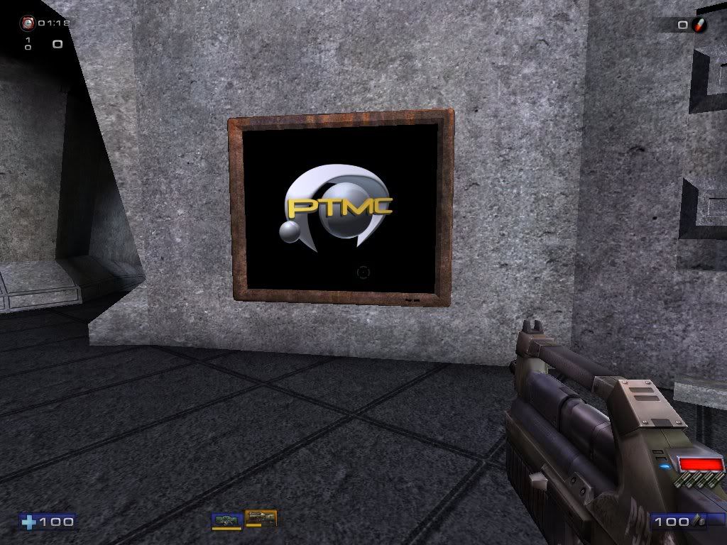
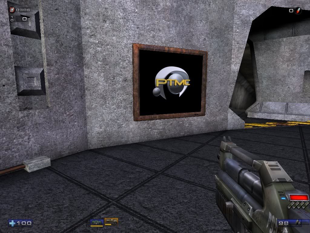
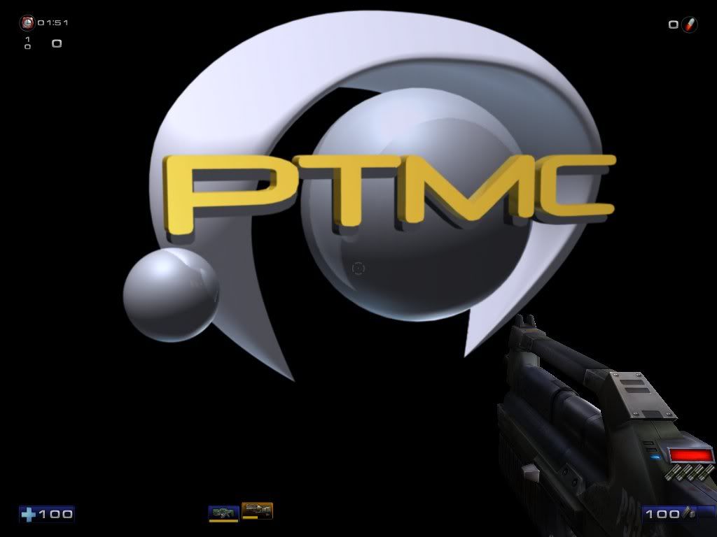
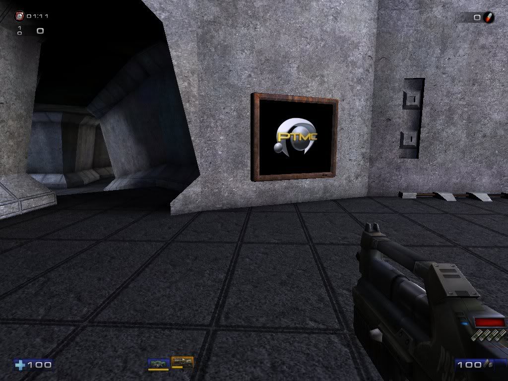
In other news, I completed the classic PTMC logo. I made a 3d model of the logo and rendered it from the angle it appears in the sign. I notice that the lighting in my recreation and the lighting on the original are strikingly similar, which leads me to believe that the original PTMC logo was actually modeled in 3D as well.
PTMC 1: The classic PTMC logo
PTMC 2:
PTMC 3:
PTMC 4:
PTMC 5: And just in case anyone is interested, I made a 1600x1200 desktop image of the PTMC logo just for fun.
UPDATE:
I found that the desktop image actually caused all the text in this forum page to wrap around much farther out, so I’m replacing the desktop image with a link to the image. Note: If the edges appear jagged or grainy you simply zoom in to actual size.
View Desktop version.
UPDATE:
I just rebuilt the model, and I now have a more detailed and much cleaner version of the PTMC logo. Note: If the edges appear jagged or grainy you simply zoom in to actual size.
View Desktop version 2.
Thanks everyone. Take care.
- Testiculese
- DBB Material Defender
- Posts: 4689
- Joined: Sun Nov 11, 2001 3:01 am
- sushi.h.a.
- DBB Ace
- Posts: 65
- Joined: Tue Oct 18, 2005 2:51 pm
- Contact:
The Desktop PTMC image was rendered with production quality antialiasing. If your browser is displaying it smaller than its actual size it will appear to lack antialiasing and have jagged edges galore. That may be what your seeing.
That said, I will be releasing a fancier version sometime soon.
Thanks for the notice though. Take care.
That said, I will be releasing a fancier version sometime soon.
Thanks for the notice though. Take care.
- sushi.h.a.
- DBB Ace
- Posts: 65
- Joined: Tue Oct 18, 2005 2:51 pm
- Contact:
Certainly you can use it.
In fact, I could render a 64x64 version of it if you want.
I’ll also see about posting the actual 1024x1024 textures as well.
I ultimately plane on releasing the library of new descent content I’ve built for this level.
I ultimately plane on releasing the library of new descent content I’ve built for this level. I also plan to include 64x64 versions of all the textures for original Descent 1 and 2 level editing. I will likely do something similar for D3 editing.
- Shadowfury333
- DBB Ace
- Posts: 326
- Joined: Mon Aug 09, 2004 8:36 pm
That would be really useful for the guys over at Into Cerberon. You might want to inform them of thatsushi.h.a. wrote:Certainly you can use it.
In fact, I could render a 64x64 version of it if you want.
I’ll also see about posting the actual 1024x1024 textures as well.
I ultimately plane on releasing the library of new descent content I’ve built for this level.
Thank you.sushi.h.a. wrote:Certainly you can use it.
In fact, I could render a 64x64 version of it if you want.
D2X-XL can handle hires textures up to 2048x2048 in size (uncompressed TGA), and the current hires texture projects by Novacron and DizzyRox create 512x512x32 hires textures for it, so you wouldn't have to do 64x64. 512x512 would be great, with invisible areas masked by an alpha channel. Doors in Descent 1/2 aren't polygonal bodies though like in UT2K4, but simple animated 2D textures.