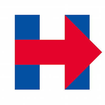
The Logo
Moderators: Tunnelcat, Jeff250
- Tunnelcat
- DBB Grand Master
- Posts: 13742
- Joined: Sat Mar 24, 2007 12:32 pm
- Location: Pacific Northwest, U.S.A.
The Logo
http://nymag.com/daily/intelligencer/20 ... -logo.html
Personally, I think it hurts the eyes, it's an unimaginative poorly done ripoff of a whole host of other logos out there, it's flat and boring and to add insult to injury, it even points to the right (I know, it means to go forward, normally. But sheeesh! Even the implication). Either she farmed it out to her subalterns, like she normally does when something menial has to be done that's beneath her attention, or she's just plain artistically clueless.
I also wish the national media would quit crowning her the presumptive queen and stop constantly running around kissing her feet and even chasing her sinister black van like they're a bunch of screaming schoolgirls who think she's some hunky rock star to swoon over. They're acting like there's not going to BE any other Democratic choice this time either. I've even heard that the Democratic machine is squelching all other up and comers so that she'll be a shoo in. God help us.
[youtube]x1ow8HvEr5M[/youtube]
Cat (n.) A bipolar creature which would as soon gouge your eyes out as it would cuddle.
- MD-1118
- DBB Ace
- Posts: 343
- Joined: Wed Jun 25, 2008 10:08 pm
- Location: Zombieland, USA... aka Florida
Re: The Logo
We passed that point long, long ago.tunnelcat wrote:God help us.
Try telling everyone you can to consider independent candidates or write-ins. This can be the year people didn't feel bullied, pressured, or trapped into voting bipartisan. It has to be, or we're seriously ****ed.
To him, boredom was a greater evil than hunger or sexual frustration, for boredom signaled the waste of a mind.
~ Anthony Piers, Ghost
- callmeslick
- DBB Grand Master
- Posts: 14546
- Joined: Sat Apr 09, 2011 8:12 am
- Location: Rockland,DE and Parksley, VA
Re: The Logo
the Democrat party apparatus clearly does NOT wish there to be a competition for the nomination, but there is going to be one. She might well do about like she did the last time, unless she radically ups her game.
"The Party told you to reject all evidence of your eyes and ears. It was their final, most essential command."
George Orwell---"1984"
Re: The Logo
I think the opposite. As someone who used to do this stuff professionally, I can tell you this logo is doing exactly what it's supposed to and is meticulously crafted, even though it doesn't seem so. That's the brilliance of it. Proof: You are posting about the logo and talking about HRC.tunnelcat wrote:Personally, I think it hurts the eyes, it's an unimaginative poorly done...
Re: The Logo
That thing is ugly...
Had to laugh at those comments on that page.
- Nightshade
- DBB Master
- Posts: 5138
- Joined: Sun Jun 17, 2001 2:01 am
- Location: Planet Earth, USA
- Contact:
Re: The Logo
Sorry dude. That thing is ugly.vision wrote:I think the opposite. As someone who used to do this stuff professionally, I can tell you this logo is doing exactly what it's supposed to and is meticulously crafted, even though it doesn't seem so. That's the brilliance of it. Proof: You are posting about the logo and talking about HRC.tunnelcat wrote:Personally, I think it hurts the eyes, it's an unimaginative poorly done...
Yes all logos have to be is memorable- though that logo is extremely forgettable. As much as I hate Obama and what he's stood for, his logo artist was good. Hillary's logo is a stinker.
.
"Political power grows out of the barrel of a gun" - Mao Zedong
- Tunnelcat
- DBB Grand Master
- Posts: 13742
- Joined: Sat Mar 24, 2007 12:32 pm
- Location: Pacific Northwest, U.S.A.
Re: The Logo
I'm not talking about her in a good way am I? I think it's too plain and jarring to look at and it still points the wrong way for a supposedly liberal politician, to the right.vision wrote:I think the opposite. As someone who used to do this stuff professionally, I can tell you this logo is doing exactly what it's supposed to and is meticulously crafted, even though it doesn't seem so. That's the brilliance of it. Proof: You are posting about the logo and talking about HRC.tunnelcat wrote:Personally, I think it hurts the eyes, it's an unimaginative poorly done...
The designer's name is Rick Wolff and he's even named the font Hillvetica. Gag me. What hutzpa. He gave the queen her own a personal font. Hail to the dynasty.
http://www.bloomberg.com/politics/artic ... ont-speaks
Here's the embedded link from the above link so that anyone can generate words with this new font, Hillvetica.
http://www.washingtonpost.com/blogs/the ... -typeface/
Cat (n.) A bipolar creature which would as soon gouge your eyes out as it would cuddle.
Re: The Logo
A logo can be ugly and still communicate ideas. Part of the design process is balancing form and function. In this case, Hillary's logo puts heavy emphasis on ideas over pleasing aesthetics. And even though I am clearly in the minority, as a design professional I could easily write a few pages on the merits of this logo. One of them is reproducibility. You can draw it with no effort at all. Got a pencil and peper? Draw a right-facing arrow and add two vertical lines through it. Simple! Here is a minimal ASCII representation I just made:ThunderBunny wrote:Sorry dude. That thing is ugly. Yes all logos have to be is memorable- though that logo is extremely forgettable. As much as I hate Obama and what he's stood for, his logo artist was good. Hillary's logo is a stinker.
Code: Select all
+-+ +-+
| | |\|
|-|--| \
|-|--| /
| | |/|
+-+ +-+
Code: Select all
HHHHHH →→HHHH
HHHHHH →→→→HH
HHHHHH →→→→→→→
→→→→→→→→→→→→→→→→→→→→→→
→→→→→→→→→→→→→→→→→→→→→→→→
→→→→→→→→→→→→→→→→→→→→→→
HHHHHH →→→→→→→
HHHHHH →→→→HH
HHHHHH →→HHHH
This design is far from "extremely forgettable." It's the exact opposite. It's brilliant. And whether you like it or hate it, you are still talking about it. Hillary is dominating the conversation. tunnelcat can't even talk about the logo without talking about Hillary. The logo is genius. As we all know, the American public only sees what is shoved in front of their faces. Underexposure is why third party candidates never make a dent in the process. If everywhere you go all you see is Hillary, Hillary, Hillary, who will people remember in the primaries? The Hillary campaign machine just squealed it's tires loudly off the starting line and everyone turned their heads. Good luck catching up.
Re: The Logo
I can't possibly vote for a candidate who would approve of such a horrible logo.
- callmeslick
- DBB Grand Master
- Posts: 14546
- Joined: Sat Apr 09, 2011 8:12 am
- Location: Rockland,DE and Parksley, VA
Re: The Logo
was going back onto this thread to ask about that very thing......not my speciality, and my visual response was sort of ,'meh'.......vision wrote:I think the opposite. As someone who used to do this stuff professionally, I can tell you this logo is doing exactly what it's supposed to and is meticulously crafted, even though it doesn't seem so. That's the brilliance of it. Proof: You are posting about the logo and talking about HRC.tunnelcat wrote:Personally, I think it hurts the eyes, it's an unimaginative poorly done...
"The Party told you to reject all evidence of your eyes and ears. It was their final, most essential command."
George Orwell---"1984"
- callmeslick
- DBB Grand Master
- Posts: 14546
- Joined: Sat Apr 09, 2011 8:12 am
- Location: Rockland,DE and Parksley, VA
Re: The Logo
sensing a bit of tongue in cheek, there, Vander?
at any rate, after vision's breakdown, I now realize it is a subliminal math message, "H{illary} is greater than.
OK, maybe that's a stretch. Still, 'meh', but some folks noticed, I guess.
at any rate, after vision's breakdown, I now realize it is a subliminal math message, "H{illary} is greater than.
OK, maybe that's a stretch. Still, 'meh', but some folks noticed, I guess.
"The Party told you to reject all evidence of your eyes and ears. It was their final, most essential command."
George Orwell---"1984"
Re: The Logo
The amount of brand management that goes into every candidate should embarrass every American. We should either be embarrassed that stuff like this has any bearing on our perception of a candidate, or we should be embarrassed that our candidates think it does.
Perception management is a hell of a drug.
Re: The Logo
So...are we voting for a logo or a person?
Liberal speak: "Convenience for you means control for him, free and the price is astronomical, you're the product for sale". Neil Oliver
Leftist are Evil, and Liberals keep voting for them. Dennis Prager
A mouse might be in a cookie jar.... but he is not a cookie" ... Casper Ten Boom
If your life revolves around the ability to have an abortion, what does that say about your life? Anonymous
Leftist are Evil, and Liberals keep voting for them. Dennis Prager
A mouse might be in a cookie jar.... but he is not a cookie" ... Casper Ten Boom
If your life revolves around the ability to have an abortion, what does that say about your life? Anonymous
Re: The Logo
In this thread, a logo. I'm pretty sure no one on this board is voting for Hillary Clinton so I don't even know why there is a discussion about her.woodchip wrote:So...are we voting for a logo or a person?
- callmeslick
- DBB Grand Master
- Posts: 14546
- Joined: Sat Apr 09, 2011 8:12 am
- Location: Rockland,DE and Parksley, VA
Re: The Logo
true that, especially at the primary stage. I can see her becoming the far lesser of two evils at the General election stage, and I'm on record(elsewhere) as to the opinion that 2016 is a true watershed election as to the direction the nation is headed.vision wrote:In this thread, a logo. I'm pretty sure no one on this board is voting for Hillary Clinton so I don't even know why there is a discussion about her.woodchip wrote:So...are we voting for a logo or a person?
"The Party told you to reject all evidence of your eyes and ears. It was their final, most essential command."
George Orwell---"1984"
Re: The Logo
the logo?
meh. kind of bland.
meh. kind of bland.