It just needs a name
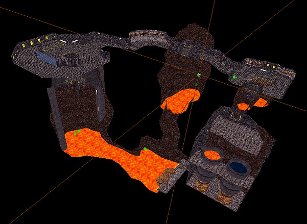
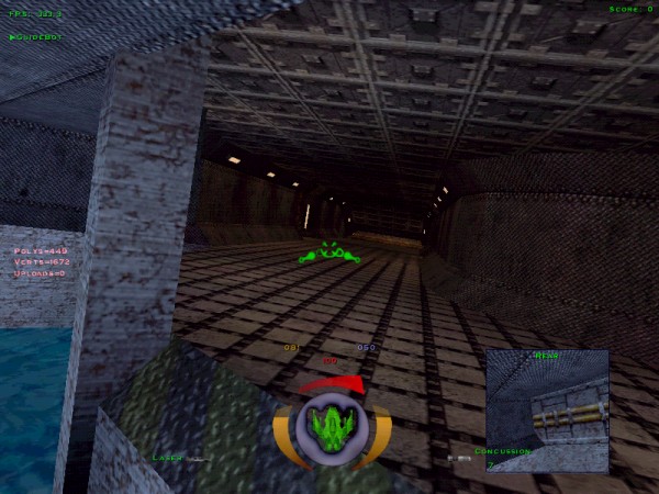
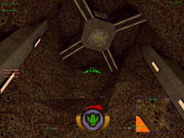
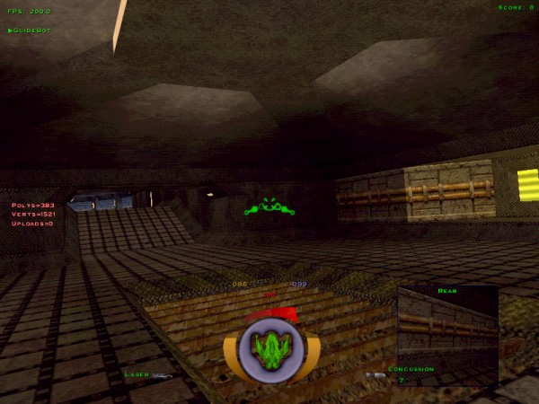
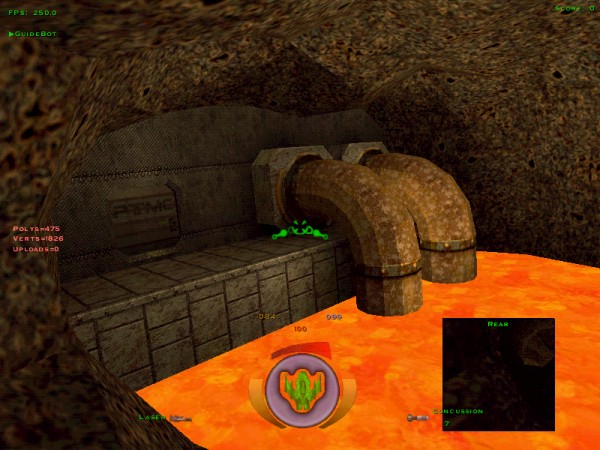
You might have guessed, it's a new D3 level. Multiplayer, as usual. It's ready for final testing, but like most of my projects it still doesn't have a name. Suggestions welcome.
- DarkFlameWolf
- DBB Admiral
- Posts: 1022
- Joined: Sat Mar 13, 2004 9:21 pm
- Location: North Carolina
- Sapphire Wolf
- DBB Admiral
- Posts: 1463
- Joined: Mon Nov 24, 2003 3:01 am
- Location: Nope.avi , gender: male
- Contact:
Well Wolf, the truth is I sold out. err.. I mean my priorities have changed. Yeah. That sounds better.
Previously, things such as realism, originality, detail, and creativity were important to me. I considered Biohazard to be a work of art. Players complained about getting hung up on the cables and handrails. I wanted the level to be about precision flying and careful use of weapons. Players want to zip through the level in their skippy Phoenii chucking missiles left and right. I put a great deal of time and effort into the design and construction of my levels. People played Stadium and Abend. So this time, I'll give the players what they want: less polygons, more weapons!
...
Ok that's somewhat tongue-in-cheek, but really not far from the truth.
This is a simpler level than my previous works. Gameplay was formost in my mind this time. Ease of flying meant no protrusions for the ships to get caught on. Ease of finding other ships to fight and weapons to fight them with meant a simple, small layout. And it had to be something I could build quickly, because I don't have weeks to build it. This level came together, from concept to completion, in about 5 days. Which is a record for me.
So I applogize to my former self, and anyone who might still feel as I did. The level is as it is. I like it, and I'm not changing it.
I also feel this level is more "Descent-ish" than my previous works, and I like that. For whatever that's worth.
Looks great! Can't wait to see it out on the servers.
A name, eh? Hmm ... the amouts of lava might suggest a name such as 'Hellfire', yet the Descent feeling might call for a name simple and pertaining to the game .. I noted that the name 'Descent' hasn't been taken
1 last thing .. how do you do rock? Iv'e been trying forever, and it always looks like some texture warping snowman.
Not a good analogy, eh?
Arbitar:
"Hellfire" has been used. One of Vertigo's levels iirc. Very nice little level.
Rock, eh? I'm actually very pleased with the way the rock came out in this level. The construction process went something like this:
-Start with a basic shape, cylinder, box whatever the basic shape you want the room to have. Divide up the walls into a grid (not too small of a grid, you'll wind up with far too many polygons). You can use the Split Faces at Plane function to do this, or just do a bunch of extrudes. Whatever works.
-Then just start randomly moving verts until you get a nice "crumpled" shape. Don't forget to triangulate all non-planar faces when you're done. Well, you can triangulate at any point, but if you wait until the end, you might find a few faces are still planar, and you can save a few polys by not triangulating them.
-Apply a nice rock texture. Mark all your rock faces (if you have the latest D3Edit build, and you really should, you can use the Matching Textures function on the Mark bar). Align, Marked Faces, Default UVs. Don't skip that step, it's important since after moving the verts around all the texture coord will be slightly off and you'll get "warping" textures. You don't want that.
-Also, consider the scale of your texture. If you're dealing with large faces where the texture tiles multiple times across a single polygon, consider enlarging the texture. For this level, all the rocks (and lava) had their texture scaled x2 (200%). In the Texture Align box, set the scale to 2, or 1.5, 1.2, whatever, and Expand U and Expand V. I wouldn't recommend going above a scale of 2 however, because while you're increasing the area covered by the texture, you're loosing texture resolution.
-Now, you won't be able to perfectly align a texture across an uneven wall, nor do you really want to in this case, but you should try to align the texture across as many convex edges as possible. Texture seams aren't nearly so bad on concave edges.
-And don't forget about the lighting. Good lighting is key. No matter what you do with the shape or textures, the wall will be ugly if it's over-lit. You want the lights to bring out the shape of the walls. Keep the Ambient Light setting low, if you use it at all. And mind the position of the lights in the room. Lights that are near parallel to the wall will show off the rock shapes nicely. Lights perpendicular to the wall won't. Personally, I love the way the lava pools light up the walls in this level.
And that's it. That's all the rock-building tips I have. Of course, that's coming from someone who has yet to release a level with any caves or rock walls; This will be my first. I think the rocks in this level look fantastic, but that's me. You'll have to judge that for yourself when this level is released.
- Wolf on Air
- DBB Admiral
- Posts: 1872
- Joined: Mon Dec 13, 1999 3:01 am
- Location: Stockholm, Sweden
- Contact:
- Vindicator
- DBB Benefactor
- Posts: 3166
- Joined: Mon Dec 16, 2002 3:01 am
- Location: southern IL, USA
- Contact:
- Diti
- DBB Ace
- Posts: 135
- Joined: Fri Aug 02, 2002 2:01 am
- Location: Muenster, Germany/North-Rhine Westfalia
- Contact:
Hi scottris!
Nice looking level! looks like a cave in a vulcano. So "Vulcave" could sound nice?!
To the poly count problem:
I also know this problem and that is the reason why I reduced (after it has been alredy finished...sigh) the poly count to a third. Why? The reasons are the same you gave: The players want to rush thru the level - wanna have a fast gameplay...hmmm..and maybe some eyecandy, but not to much because you want to focus on the others and not on the look of the level.
Take a look at the levels that are played in "heavy rotation": are there any among them who have much eyecandy or many polies? - nay...almost NOT.
So: Player get's what player wants: ugly levels for fast gameplay and an easy-to-target-opponent
To the rocks:
There exists a nice tutorial for building rocks
But anyways: I do it the same way like you (no... I "extrude" and don't "split faces"....hm...doesn't matter...)
I wanna add (for those who think about creating rocks) that you are dealing with many many polies when you are building rocks! So take care of where you place them within a level! A room with 10 rocks and 3000 polies might be looking awesome (with cool lighting) - but would be playable in singleplay mode only.
To the lighting:
I have recognized that low-poly levels gotr more airplay. - ok - but these levels have a "lighting" that doesn't really deserve the pradicat: good/ambiant/cool or whatever. Most levels of this kind look quit white. (not to be rassistic )
I am well known for my colorful levels - but I am often criticied therefore.
But lighting is more important than many might think: build a room w/o lighting: fly thru it an find it ugly! - now put in some (ambient) light: fly thru it and see how completely different the room looks alike!
My 2 cents.
Diti
I still don't understand why you can't combine good looks with playability...
Example 1
Example 2
And yes, HellFire is taken
Ultimately i think it's the weapon layout that make people play or not play a level...
If you make a missile boating level then the chances of it becoming popular ar 10 times higher than with a more 'dogfighting' weapon loadout....
But that's beating a dead horse, i guess.
Level looks ok scottris, not jaw-dropping, but better than most stuff out there.
(/me is fan of high-poly goodness)
- DarkFlameWolf
- DBB Admiral
- Posts: 1022
- Joined: Sat Mar 13, 2004 9:21 pm
- Location: North Carolina
Amen Vertigo. It takes one thing for someone to make a perfectly good level with awesome gameflow. It takes an even better level designer to do the same thing but add beautiful eye candy to it that isn't distracting or something you can get caught on. Must find that balance. And Lothar, I already suggested 'The Deep.'Vertigo wrote:I still don't understand why you can't combine good looks with playability...
Example 1
Example 2
And yes, HellFire is taken
Ultimately i think it's the weapon layout that make people play or not play a level...
If you make a missile boating level then the chances of it becoming popular ar 10 times higher than with a more 'dogfighting' weapon loadout....
But that's beating a dead horse, i guess.
Level looks ok scottris, not jaw-dropping, but better than most stuff out there.
(/me is fan of high-poly goodness)
- Diti
- DBB Ace
- Posts: 135
- Joined: Fri Aug 02, 2002 2:01 am
- Location: Muenster, Germany/North-Rhine Westfalia
- Contact:
You will find exceptions for everything....
We tested subwaydancer over months before Atan released it. The main thing we tested: weapon layout and balance.Vertigo wrote:Ultimately i think it's the weapon layout that make people play or not play a level...
If you make a missile boating level then the chances of it becoming popular ar 10 times higher than with a more 'dogfighting' weapon loadout....
But that's beating a dead horse, i guess.
Let me say that weapon layout is besides other one of the more important thing to focus on.
(/me thinks that we are gettin a bit offtopic....hehe...should we open a new thread "hints und tricks for level-designers" ? )
/me 2 I wish the 3D engine would be more powerfull....Vertigo wrote:(/me is fan of high-poly goodness)
Diti
I'm not saying I built a Skybox* here. Frankly, I think this level is a great balance between good looks and low framerate. Truth is, I don't see it as "bare and empty". I think this is actually my best looking level yet. Despite the lack of railings and ladders.
Not that I don't appreciate the feedback, but I'm satisfied with the geometry. Now it just needs some testing to assure the weapons load is adequate.
Although there is one room with which I'm not very pleased, but I'm just going to let it go. Not worth holding up the level for.
Thanks for all the name suggestions. Picking just one isn't going to be easy.
* Not that I have anything against Skybox. It's a good level. It just also happens to be a good example of an extremely low poly structure.
-
- DBB Ace
- Posts: 484
- Joined: Fri Nov 16, 2001 3:01 am
- Location: Staten Island, New York USA
- Nightmare USA
- DBB Ace
- Posts: 155
- Joined: Sat Oct 06, 2001 2:01 am
- Location: New York
- Contact:
- TIGERassault
- DBB Admiral
- Posts: 1600
- Joined: Tue Aug 10, 2004 3:33 pm
level names
Picking level names gets a lot easier if you add a theme to them.
- DarkFlameWolf
- DBB Admiral
- Posts: 1022
- Joined: Sat Mar 13, 2004 9:21 pm
- Location: North Carolina
- TIGERassault
- DBB Admiral
- Posts: 1600
- Joined: Tue Aug 10, 2004 3:33 pm
A name for your level
If you turned the lava into acid then you could call it "Poison Production Factory".