Page 2 of 5
Posted: Tue Nov 29, 2005 10:47 pm
by Darktalyn1


Some updates to the canteen & battlehorn - And a GI render this time
Posted: Tue Nov 29, 2005 11:21 pm
by Image
What are you going to use it for?

Posted: Wed Nov 30, 2005 10:42 am
by Darktalyn1
Well, this guy is going to end up being my learning tool for a few different things
Zbrush + Normal Mapping pipeline
Binding/Rigging
Rigid Body Dynamics
Cloth Sim
Facial Animation
I'd like to touch on all of these things and try to create a workflow for myself... mostly I just wanna make something in which the end result will not only look cool (I hope!) but also where I will learn a lot along the way.
Posted: Sun Dec 04, 2005 3:27 pm
by Darktalyn1
small update, I modeled the pouches that line his midsection, and the diagonal strap that holds his horn

Posted: Sat Dec 10, 2005 12:05 am
by Image
/me says ":oops:"
Posted: Sun Dec 11, 2005 8:56 pm
by Darktalyn1
some more work this weekend...
The viles I added on his strap look a bit like machine-gun bullets in this shot. I lessened the amount to 3 and spaced them out a bit more, but there will be more changes coming...

Posted: Mon Dec 19, 2005 10:03 pm
by Darktalyn1
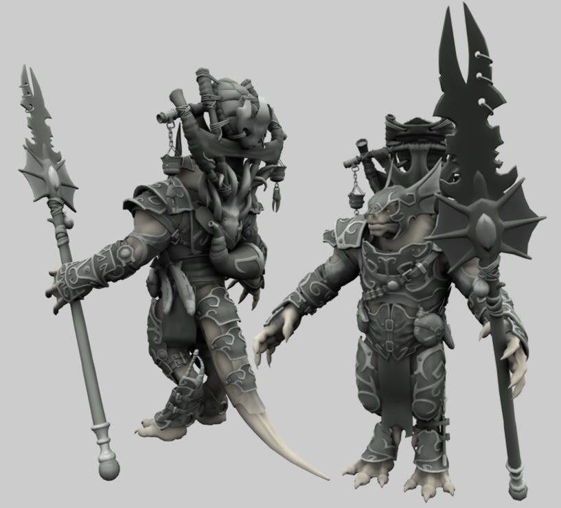
I didn't like the way the thigh armor looked so I remodeled it tonight - here's the shot

Posted: Mon Dec 26, 2005 1:09 pm
by Darktalyn1
did some work before xmas, here's a couple of update shots:


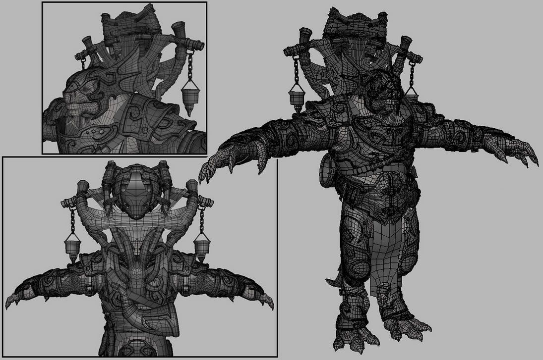
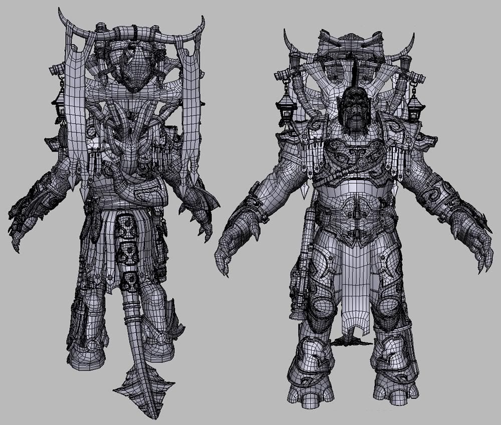
Basically finished the arm & leg gear, and I mostly finished the standard. The wire shots are a little more up-to-date than the shaded renders. Only real difference though is that I changed the cloth so it wasn't covering up the squid design as much
Posted: Wed Dec 28, 2005 5:56 pm
by Darktalyn1
just a small update

Posted: Wed Dec 28, 2005 5:57 pm
by Darktalyn1
just a small update

Posted: Tue Jan 03, 2006 11:35 pm
by Darktalyn1
just for fun

Posted: Tue Jan 03, 2006 11:49 pm
by Kyouryuu
You might think no one is watching, but I am.

A very astonishing reptilian. I can appreciate this more now that I'm fervently trying to figure out Blender.

Posted: Wed Jan 04, 2006 1:28 pm
by Sirius
Yeah... you have some serious skills with this stuff. Especially after scanning through the works of large numbers of modellers who can't even get a machine looking right...
Posted: Thu Jan 05, 2006 1:18 am
by fyrephlie
very nice!

i once figured out how to make a sphere.... i was proud of myself, 'til now!

Posted: Sat Jan 07, 2006 12:07 am
by *JBOMB*
The octopus in the pack is so money..
So are you skills DT...just wicked cool is that thing..
Its so different from the orignal concept i think when yer dont with this one you should just roll out that other one as well...
Maybe pretend its the enemy of this new one..[beavis] heh..yeah..like maybe they have like the same father..but like different mothers....and now like..hate each other nstuff...[/beavis].......i dunno..sweet looking though...
Posted: Tue Jan 10, 2006 6:27 am
by []V[]essenjah
Extremely nice work!!
I can see that you did this in Maya. Very cool program, although I still like Max's modifier system over Maya's history system for some reason. I may get used to Maya though.
So, I take it you can ZBrush a box model? Cool, I didn't know that... I thought you had to use some sort of high poly nurbs-like mesh or something of the sort. I do understand that is designed as a system that is similar to modeling from a ball of clay. It's been a while since I studied up on it. Since I do mostly low-poly stuff I never have had much interest in it but now that I have a Wacom and I've been playing around with subsurf systems I'm starting to become more interested in expanding into high-poly territory.

Right now I'm working on a cyclops in Blender.

I originally intended it to be just a simple low-poly mesh for Morrowind but after playing with catmul-clark subsurf, I'm starting to have a lot of fun with it, and it's becoming a high-poly model. I'll probably work on the high-poly and low poly versions together.

Posted: Fri Jan 13, 2006 10:36 pm
by Darktalyn1
Wow! Well firstly thank you everyone for your replies, it was pretty lonely in here

Your comments have helped my resolve to see this long, daunting project through to completion
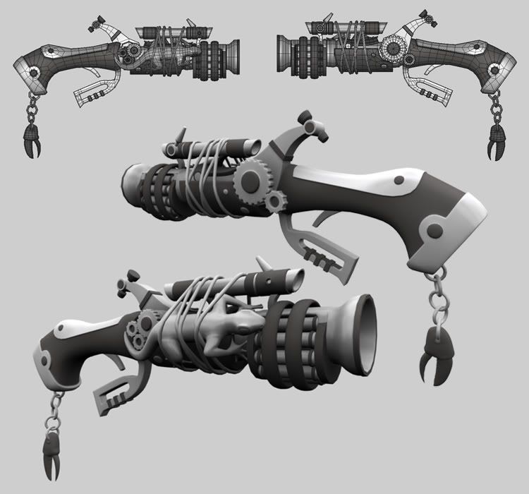
Here is a repeater that I modeled for him

This isn't actually the most up-to-date image, I did a little bit more work on it after I made this but I'm too lazy to make a newer version
I'm still not happy with the overall look of this guy, so over this 3day weekend I'm going to be starting Overhaul #2... I've got some new sketches that I think, if I can translate into 3d, will make this project a lot better.
The armor will be staying very close to the same, but the body proportions will be changing yet again and I will be completely revamping the head
Wish me luck!
Re:
Posted: Fri Jan 13, 2006 10:38 pm
by Darktalyn1
Messenger;
Yup you can Zbrush a box-model. I'm doing all my base modeling in Maya, then will be creating all my hires modeling/detals in Zbrush. Then creating my normal maps for the base geometry - I hope the end result will look good!
Posted: Sat Jan 14, 2006 9:22 pm
by Duper
LOL.. wth at the geko strapped to the side of that thing!!??!?

Posted: Sun Jan 15, 2006 2:52 am
by Darktalyn1
Hi,
It's not a real Gecko

Just a decorational bronze cast like the Octopus on his back. I think textures will go a long way in making this more apparent
The straps will be attaching something else, but I didn't finish.
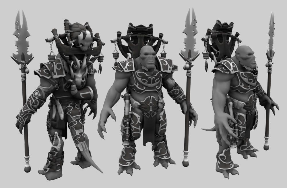
For awhile now I've found myself displeased with his proportions, and kept feeling the desire to move away from a lizard type of a creature to something a little more humanoid. Finally I decided that if I'm not happy with how this project is going, I might as well just give up or take the hit and overhaul the model.
Of course, I chose to revamp this guy in a big way

I already did it once (though at an earlier stage), so to hell with it. I figure it's best not to get scared of challenges
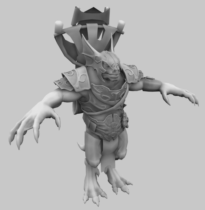
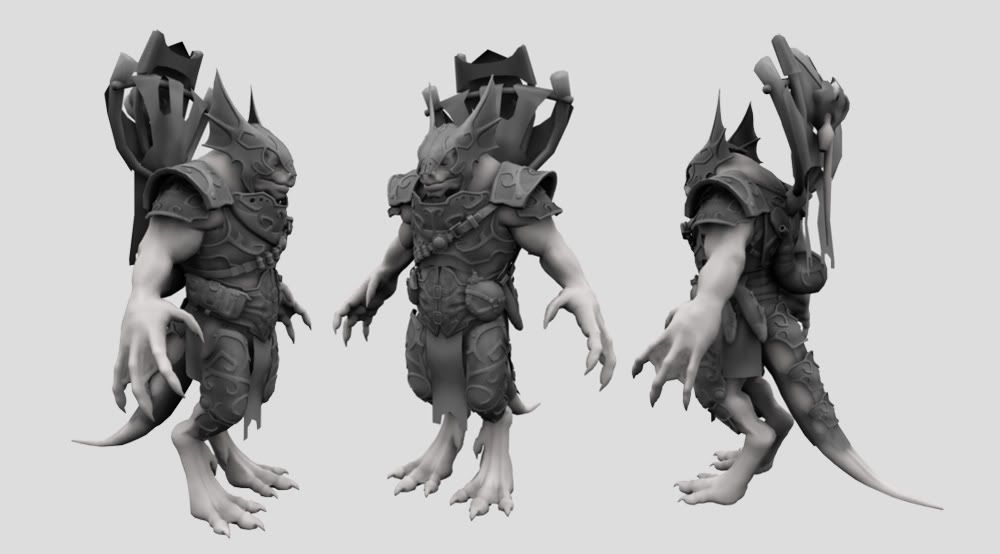
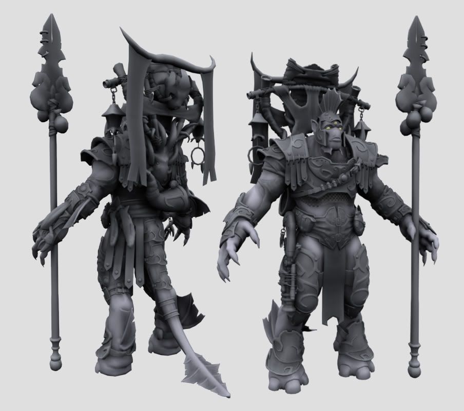
Here's a shot of how the overhaul is coming along, this stuff is still really basic at this point. Everything is roughly fitted together right now and the body is going to require a ton of clean-up, but at least it gives me an idea moving forward.

The head will be a new design (currently VERY unfinished), I'm scrapping the old helmet for a new one, will be redesigning the spear, and the arms will have assymetrical gear. I'll also be making some changes/additions to the standard.
I'm feeling a lot happier with these newer proportions, though it will be a real nightmare taking the new head and body to a finished quality level.
But, I just wanted to share how things are going, and again I appreciate everyone's feedback

Posted: Sun Jan 15, 2006 3:44 am
by Duper
the preportions are much better. It looks great.!
Posted: Mon Jan 16, 2006 1:22 am
by Neumaennl
amazingly great work! but with the new head and proportions I don't think the tail and the reptile-like feet match anymore - maybe get rid of the tail and give him some boots?
Posted: Wed Jan 18, 2006 5:12 pm
by []V[]essenjah
I agree. I kinda liked the first one the best still somehow. Second one was ok. The third doesn't look quite right. Looks like a cave man with webbed feet. The proportions do seem to be a bit better but I would still go for the lizard effect.
Your model did remind me of something, I still need to add a chin to my new cyclops character I'm workin' on.

Posted: Tue Jan 24, 2006 10:11 pm
by Darktalyn1
Thank you everyone for yoru replies, I am still plugging away, this is taking a long time - still not done reworking the body and head - or fitting the armor to him

But jsut an update so you know I'm still workign at it

Posted: Tue Jan 24, 2006 11:52 pm
by Duper
DudE!....
SICK!
o_0
er.. in a
good way i mean.

Posted: Wed Jan 25, 2006 9:24 pm
by *JBOMB*
If i were a 3D artist....you would make me want to be a waiter...

Posted: Sun Feb 05, 2006 11:45 pm
by Darktalyn1
thanks

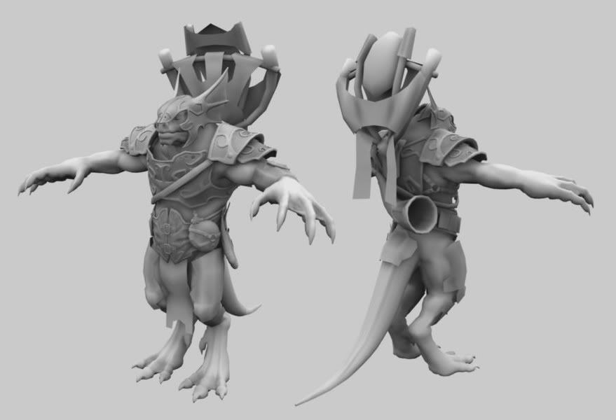
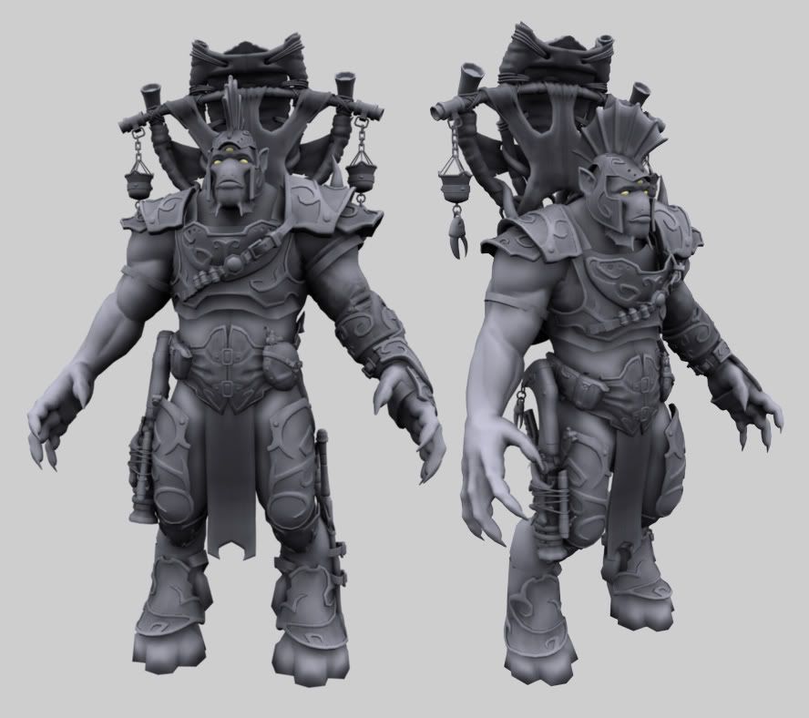
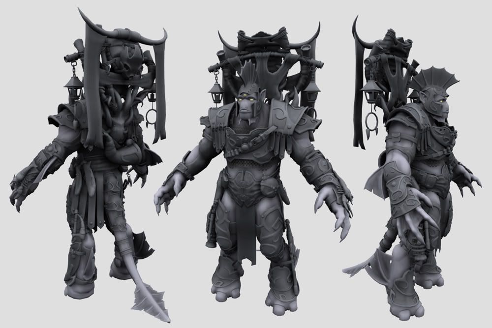
After many more evenings of work, and much gnashing of teeth, I have begun to make some discernable progress.
Unfinished areas include the arms, the standard, the spear, and the dagger (which is currently hidden in this shot)

I'd like to have the box modeling done by the end of the month, it will be a challenge to do it in time! Especially cause I am completely tied up next weekend
Posted: Mon Feb 06, 2006 6:23 pm
by *JBOMB*
Man..Pure ownage..really..
If i may offer some constructive criticism?
There is an expression we use in my office (Creative Design Firm)...It's called \"Rounding Home\"...
Rounding home is when someone has already scored a home run with a creative art piece but has been living with it for so long that they keep tweaking it..They try and make it back to first base

To me..the new horns with draping fabric on the backpack is rounding home...You had clearly already hit a home run..I think it takes away from those AWESOME lamp type objects that hang from the pack and takes away from the packs over all shape(seems no longer as balanced)...with all the detail in uniform and accessories the thick solid shape of the draping \"fabric\" draws your eye too it and away from the detail (though im sure you have plenty of detail coming up for that)

my 2!
With that said DT let me once again tell you how amazing i think yer work is....just freakin awesome man...
Posted: Mon Feb 27, 2006 11:26 pm
by Darktalyn1
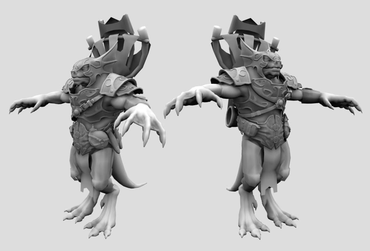
Haven't given up yet... still plugging away albeit it very slowly

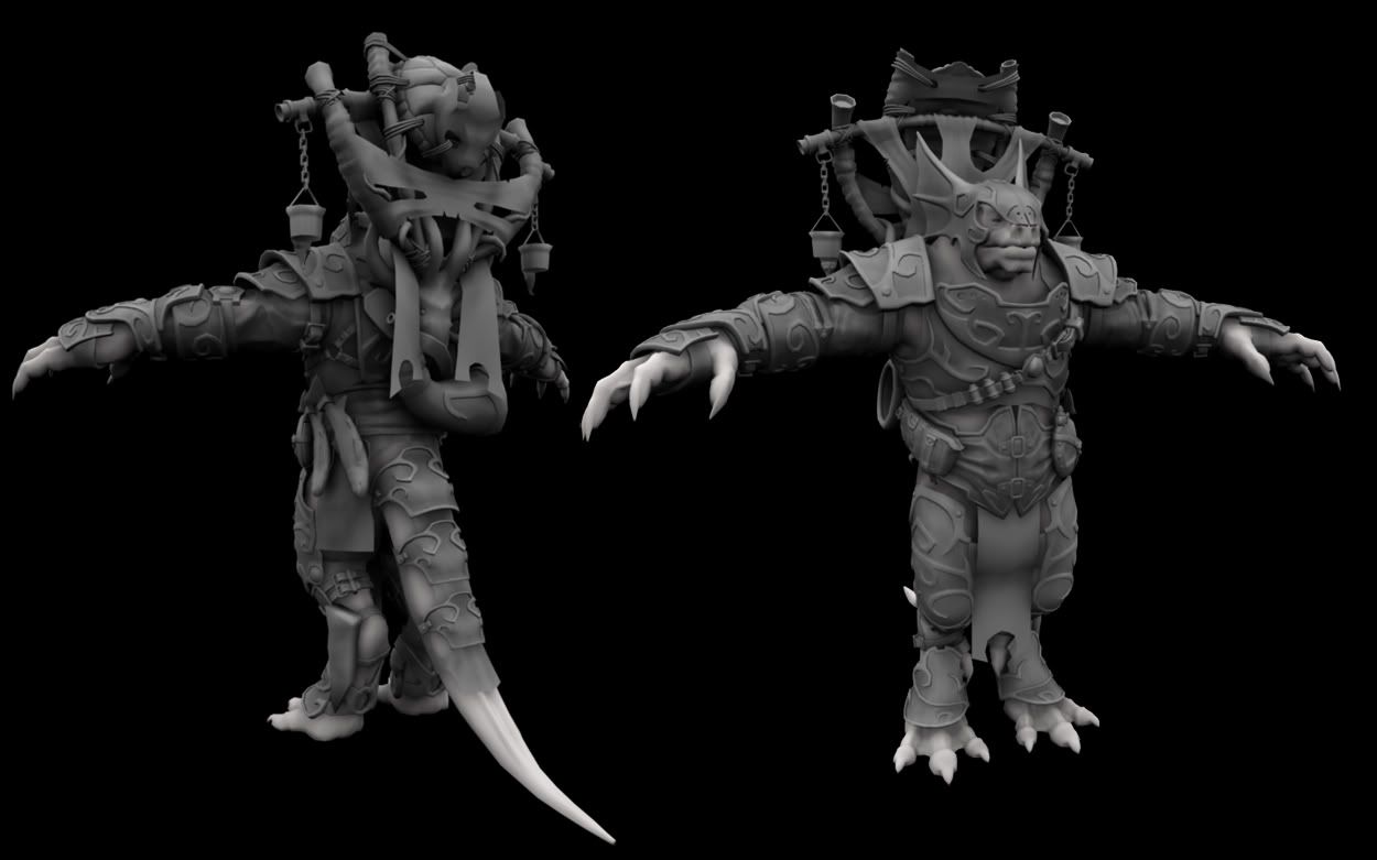
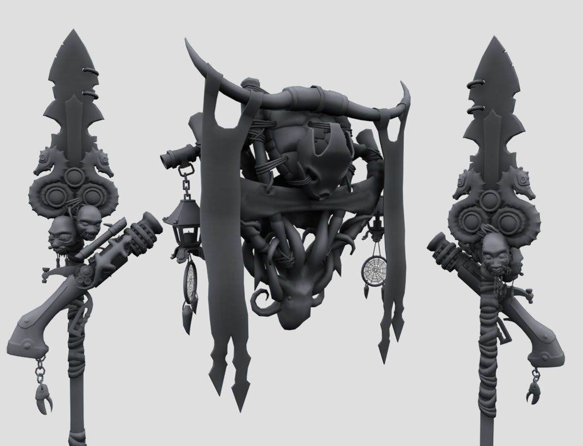
New stuff : dagger refitted and attached, arm gear finished (along with ornamental lobster for left gauntlet), finished turtle skull + horns, started work on the lanterns
Stuff left :
Finishing lanterns, finishing the banners hanging from the horns, finishing the chain mail vest + tail mail, finishing the head + modeling the inside of the mouth, modeling the spear.
Obviously I'm not going to finish by the end of February, been really dragging my feet these last two weeks

JBOMB,
I appreciate your comments man, I'm glad that you're liking it overall. What can I say? I feel like the additions to the standard on his back give more balance to the model. Once he is rigged and I get everything working (rigid bodies and cloth sim), I am excited about the idea of seeing him walking around, the lanterns bouncing this way and that on their chains with the glow they emanate causing some cool lighting effects, and the banners flapping and flowing behind him.
Well, that's just me dreaming - There's hundreds of hours of work ahead of me before I ever reach that point
Posted: Wed Mar 01, 2006 8:49 pm
by Money!
Talyn this is a ★■◆●ing awesome guy. You have no idea how cool it is seeing every update and waiting to see what you will come up with next. I like the revamp of character... this guy looks more badass.
One thing that I remember being suggested before for the other figure: the tail's muscles seem too small to support its weight and length.
Otherwise, its BEAST!
Posted: Thu Mar 02, 2006 6:15 pm
by Isaac
It looks good. Show off the normal maps when u export them!
Posted: Mon Mar 13, 2006 4:03 pm
by Darktalyn1
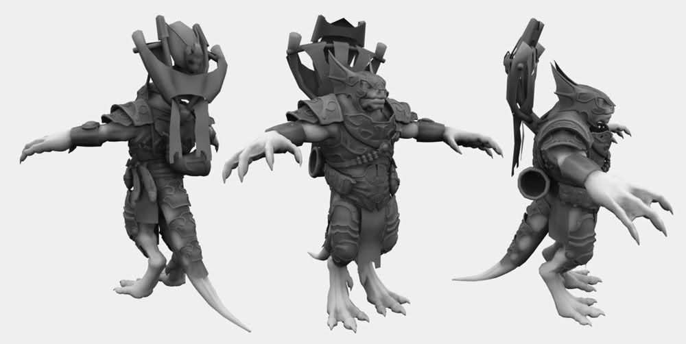
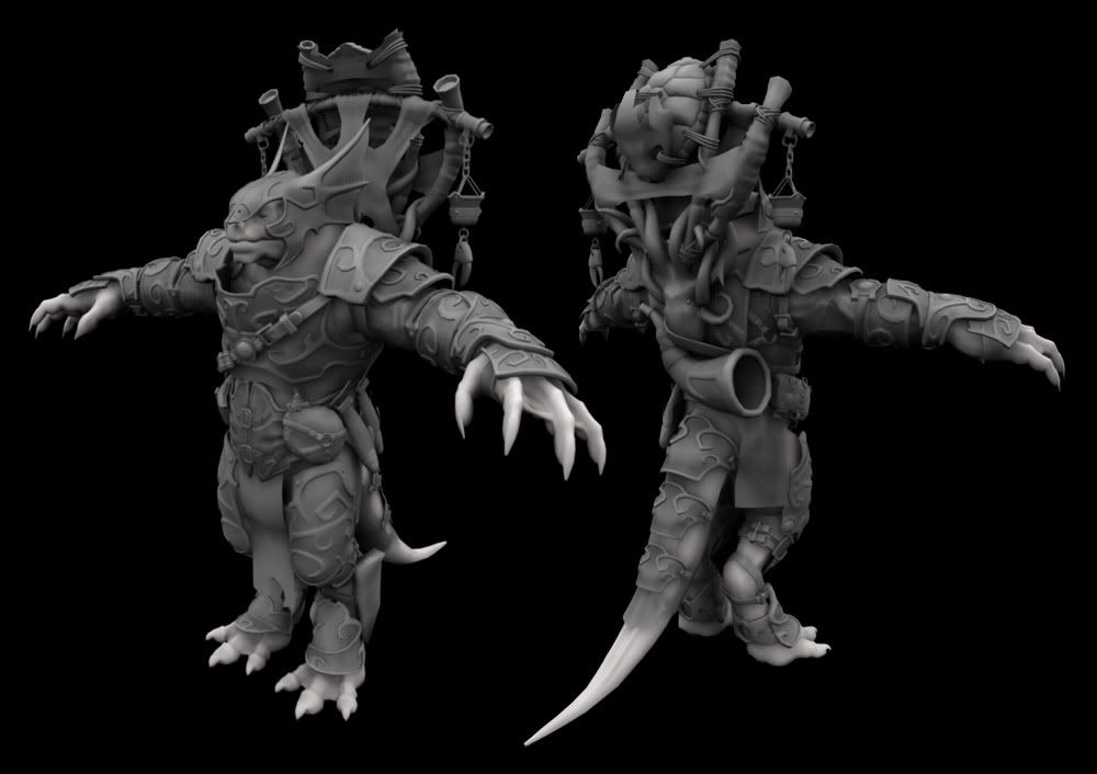
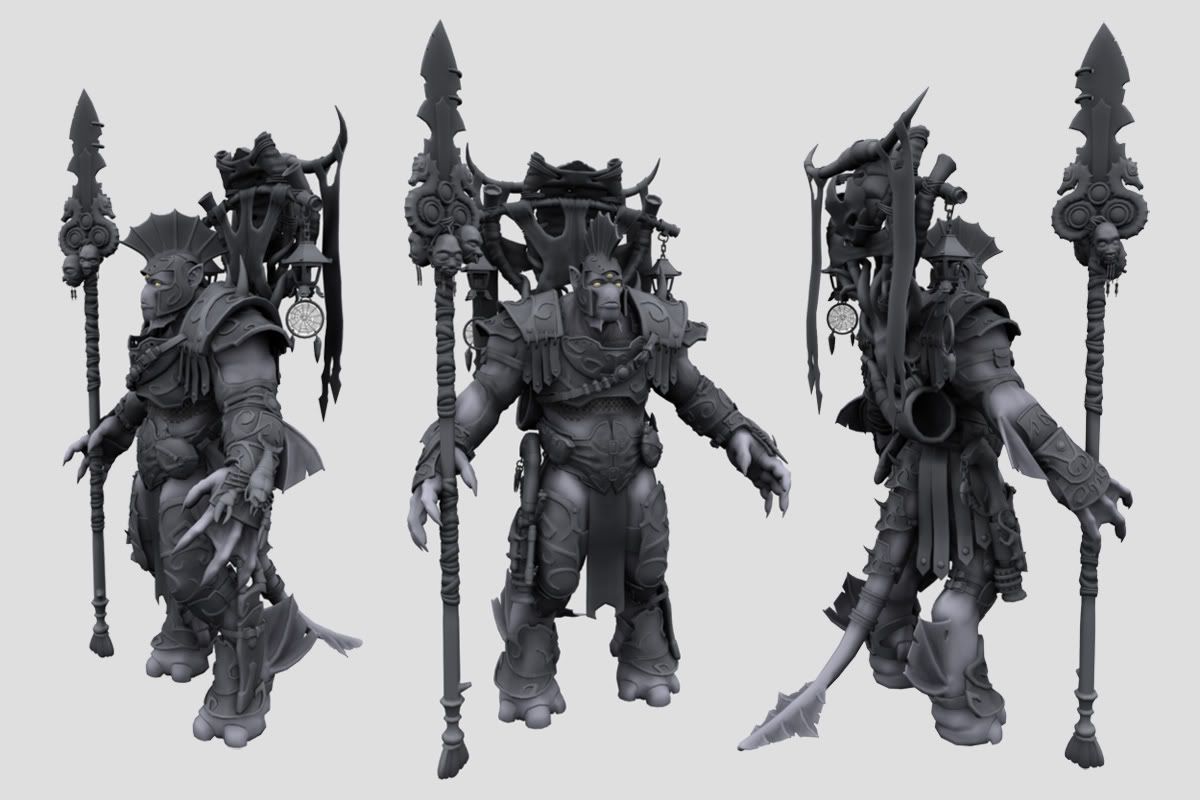
Update
Below are some shots and a few paragraphs about the character.


Algamas Highcrest, also known as \"The Webbed Warrior\" by the island folk, is a descendant of the Merunaicus race. Merunaicans are an ancient species and consider themselves the children of the Ocean. While their species borders on extinction, Algamas still represents the once proud House Highcrest in battle.
Merunaicans are a very superstitious group, and although they have adapted for life both on land and sea, they take many representative icons of the ocean with them when they equip for land-battle. These range from shells and skulls of actual creatures, to ornamental designs built into their weaponry and armor. It is believed these tokens will help a Merunaican warrior fight with all the strength of the ocean behind him.
The shrunken heads of the island folk Algamas hangs from his spear are for good luck. It is Merunaican tradition to raise your spear high above your head before battle, so that the Shemri (\"Little Servants\") can see the battlefield and advise you while fighting.
His lever-action repeater is known as \"Bellow-Maker.\" While Merunaicans have a rudimentary understanding of gunpowder, they consider it a Dragon's roar turned to ash. Because of this, they have a deep respect and partial fear of it, and will only use it as a last resort.
----------------------------------------
Thanks for any comments !
Old images are here so you can see how it looked before:
http://i21.photobucket.com/albums/b255/ ... 2shots.jpg
http://i21.photobucket.com/albums/b255/ ... /1wire.jpg
Any comments appreciated!
KOOL-AID MAN SAYS OH YEAH!!!
Posted: Tue Mar 21, 2006 9:36 pm
by Darktalyn1
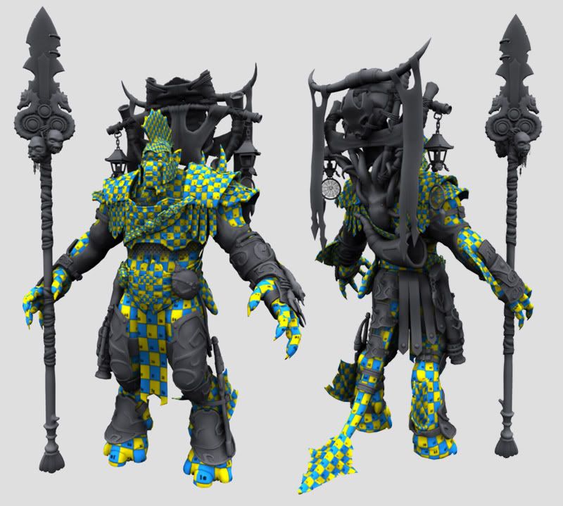
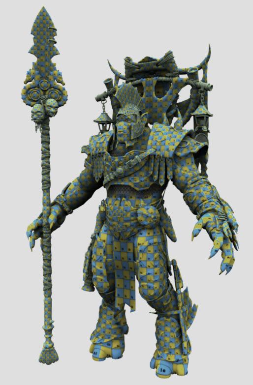
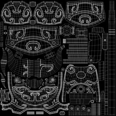
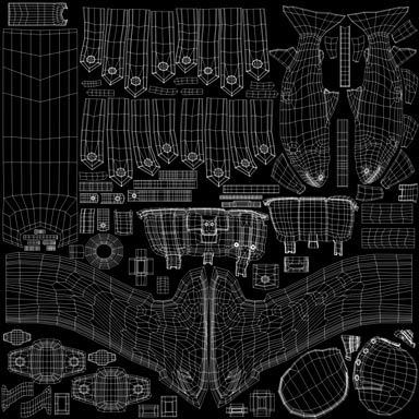
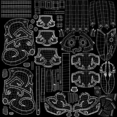
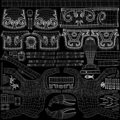
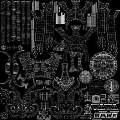
Well this is a pretty stupid update, but it represents a lot of hours of hard work

The UV's are about halfway done... Well, maybe a little less than halfway


lol
Next update will be the finished UV's, though that might take awhile... This is really boring and only gets worse the more I do
Posted: Wed Mar 22, 2006 12:01 am
by Money!
This fool is BEAST! As in really cool. Keep pluggin' away man, its really awesome. I really like your imagination for the paragraphs.
Posted: Wed Mar 22, 2006 6:04 pm
by Isaac
you or someone is going to have a blast painting this, i bet.
Posted: Tue Apr 25, 2006 9:44 pm
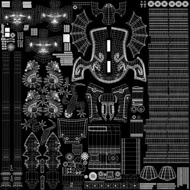
by Darktalyn1
Posted: Thu Apr 27, 2006 10:32 am
by Cyclone
Hey Darktalyn. Awesome work. Can't wait to see it textured

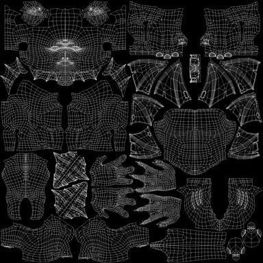
You use Maya right? I was wondering how you went about laying your uvs. You have a lot of separate objects on your character. How did you assign a uv set to a group of objects. I can only have a uv set for one object. Unless I combine the objects i want...
Are you going to animat him? That would be sweet!
Posted: Thu Apr 27, 2006 11:26 am
by Darktalyn1
What's up Cyclone,
Yeah, I'm using Maya right now. I didn't actually assign a UV set to a group of objects, but here is what I did...
I basically categorized my character's pieces into sections that I would group together on a texture map. Those sections were then assigned to correspondingly named layers. So, I can hide and unhide the UpperBodyGear layer to turn all the parts associated with it on and off.
For the UV's I just laid them out for each individual piece as its own autonomous unit. When say, all the UpperBodyGear pieces were UV'ed, I hid all the layers aside from UpperBodyGear and selected all the objects.
At this point I had a ton of overlapping UV's. By selecting one object at a time and converting to UV mode I was able to drag them around and scale them to give myself some kind of random placement that wasn't overlapping so I could at least see what I was doing.
Then, I selected all the objects again and went into vertex mode. at this point I was able to both view and edit all the UV's for all those objects in the UV editor. I would select UV shells, and scale/rotate/place them with the other shells in order to fit it together like a puzzle.
So really the trick is just being able to view multiple objects in the UV editor at once

If you need any further clarification let me know - and thanks for your interest!
[edit] Oh yeah, I definitely want to animate him - and hopefully something much more impressive than the last time I took a stab at animation

[/edit]
Posted: Thu Apr 27, 2006 12:14 pm
by Floyd
uneffingbelievable

a beast, no matter how you look at it. and you beat it. great work DT!

Posted: Sat Apr 29, 2006 1:06 pm
by Cyclone
Thanks Darktalyn. I got my uvs good now.

