Page 3 of 8
Posted: Tue Feb 26, 2008 4:23 pm
by DarkFlameWolf
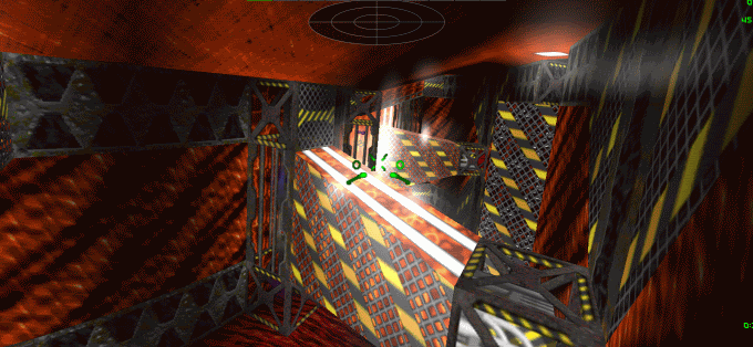
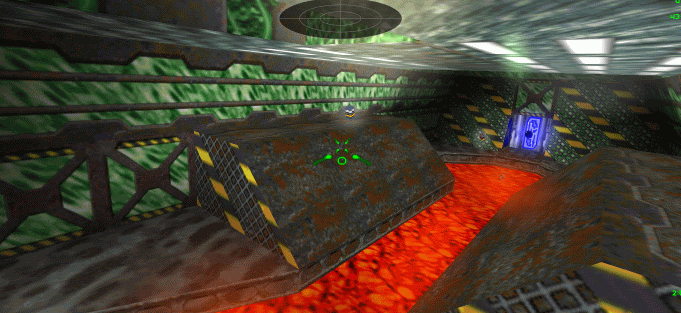
sure, I'll probably whip up some more refined screenshots when it comes time for the release thread. But for right now I'm taking these on the fly during production utilizing my current graphic settings. Anyhoo, as for the single player set, I just got 2 new full levels + 1 half level so far from the other designers at once. So that was a good jump in progress.
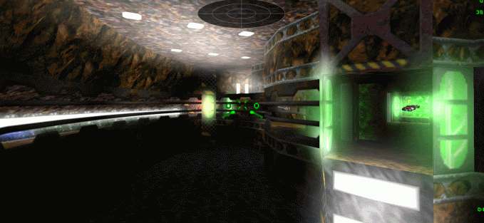
As for the multiplayer set, I'm debating on if I should leave it at the pre-planned 5 levels or add a sixth one. Regardless, here is a screenshot from level 2 of the multiplayer set. Its water-themed and is quite curvy and has views across the level as you can see. Should make for some interesting battles I hope!
(screenshots below)
Posted: Tue Feb 26, 2008 7:18 pm
by d3jake
Alrighty, thanks ahead of time.
Posted: Fri Feb 29, 2008 6:42 pm
by Kyouryuu
You really need to take the bloom down a few notches. XD
Posted: Fri Feb 29, 2008 6:56 pm
by DarkFlameWolf
personal play preferences I guess, that and if its on any other setting, my computer graphics card starts freaking out and doing weird $hitz with the blooms.
so maybe I'll get someone else to do screenshots for me before final release. XD
Posted: Sat Mar 01, 2008 5:43 pm
by Diedel
I don't know your corona settings, but if you don't already try high quality and low or lowest intensity.
Posted: Mon Mar 03, 2008 6:11 pm
by DarkFlameWolf
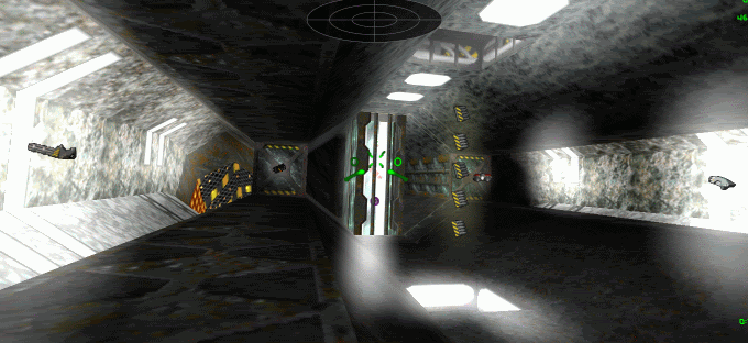
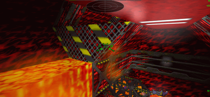
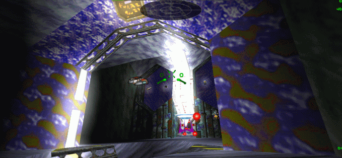
Here are screenshots of the final six levels of the multiplayer level set that will be included with the Single player set.
Most levels tend to have a smattering of these weapon loadouts:
4 afterburners
2 prox bomb packs
lasers
few super lasers
1 vulcan
1 guass
smattering vulcan ammo
2 spreadfire
1 helix cannon (hidden and only a few levels)
few plasma cannons
1 phoenix cannon (last few levels)
few fusion cannons
(NO OMEGA CANNON)
1-2 cloaking devices (hidden)
a few packs of concussion/flash/guided/homing/mecury missiles
smart missiles (hidden at first, but more open in the final two levels)
mega missile (or two, and always hidden)
smart mine pack (hidden always)
earthshaker missile (only one, in final level, and hidden)
Now for screenies:


Posted: Tue Mar 04, 2008 6:17 pm
by Diedel
Is it correct that you have been using standard lighting for your screenshots, and have turned colored lighting off? And have you been using the old or the new render path?
Edit: My main point of criticism is that the levels are way too bright for my taste - almost like every light would be fully bright, white light. As the lighting seems to have been done w/o checking it against D2X-XL OpenGL style dynamic lighting, that effect gets really bad there.
When creating a level with D2X-XL in mind too, it is a good idea to adjust the lighting so that it looks good with D2X-XL's OpenGL lighting (because that lighting method leaves little freedom to light settings), and then tune the lighting for standard lighting, as DLE-XP (or DMB2 if you prefer buggy lighting for the sake of being able to use a messy user interface) gives you great freedom here and allows you to achieve the desired effect and still keep good lighting with OpenGL style lighting.
Posted: Thu Mar 06, 2008 8:45 am
by Alter-Fox
Just to let you know, if you decide to do custom music and you don't have enough for some reason, you could still use Viral Evolution if you decide to. Pumo didn't use it.
EDIT: I now have some ideas for levels that might work for this campaign, but unless you can wait a year or two for me to finish them (I'm allowed very little free time on the computer at home), you wouldn't be able to use them. They also wouldn't have names, because for some reason naming the level in DLE-XP gives me an error in the mission file. I also don't think I can commit my skills to this, especially as schoolwork has to take priority over everything else, so that I can get into University.
BTW - Those screenshots look awesome. I can't wait to play this mission.
Re:
Posted: Fri Mar 07, 2008 7:29 pm
by Kyouryuu
Diedel wrote:Edit: My main point of criticism is that the levels are way too bright for my taste - almost like every light would be fully bright, white light.
I don't think it's too bright, I think the coronas are way, way too big. For proper corona use, you need to look at games like Unreal Tournament 2004 or Half-Life 2. Coronas are a lot more subtle.
Posted: Fri Mar 07, 2008 7:46 pm
by Diedel
Posted: Fri Mar 07, 2008 10:36 pm
by DarkFlameWolf
not sure why you went through some trouble to change them to D2-XL only levels, because I've made some changes to my six levels including lighting issues, item balance and yes that fuel center issue you brought up in level 3. I've fixed that in my own way. So I'm not exactly sure why you are making a completely separate version of it based off my designs, and this early when we both know these are still beta and are subject to change. I just feel that you're putting work into something that isn't final yet and could change without notice.
Re:
Posted: Fri Mar 07, 2008 11:36 pm
by Pumo
Alter-Fox wrote:Just to let you know, if you decide to do custom music and you don't have enough for some reason, you could still use Viral Evolution if you decide to. Pumo didn't use it.

But i DID use it, you can download the mission with the music on my website... It's only that it will not work with FM synths...

EDIT: Oh, wait, you're talking only about Viral Evolution right? If that's the case then it's true, i haven't used it

Re:
Posted: Sat Mar 08, 2008 3:54 am
by Diedel
DarkFlameWolf wrote:not sure why you went through some trouble to change them to D2-XL only levels, because I've made some changes to my six levels including lighting issues, item balance and yes that fuel center issue you brought up in level 3. I've fixed that in my own way. So I'm not exactly sure why you are making a completely separate version of it based off my designs, and this early when we both know these are still beta and are subject to change. I just feel that you're putting work into something that isn't final yet and could change without notice.
#1 Because it was fun to tweak a good design
#2 To show you what I mean instead of just talking about it and thus maybe convice you (the last version I had sent you had lighting flaws though - it was just too late)
#3 Because placing some fx in there might show you how to do it
Don't worry about my work time. I am not gonna release your stuff, so there is no need to worry either. The most the public will see is some screenshots from the same spots you took yours.
One issue that comes to my mind right now is that you have been using some walls in Unbridled to separate some areas of the level where on one side is a lava flow (over a solid wall) and on the other side a solid wall. That doesn't work with D2X-XL. You need to "solidify" the affected cube sides instead (DLE-XP has such an option). That will even save two walls. If you don't, the lava flow will be transparent.
From what you have sent me all I can say that your lighting tweaks have as good as no positive impact with OpenGL lighting, because the only influence you have there is number and brightness of lights. Just decreasing light range and general brightness with DLE-XP lighting has no effect here. Your lighting is so bright that you could as well make everything 100 bright. These levels will look way better with proper lighting and way less light sources. You should fly through my versions of your levels, get all guns ("minemine") and fire them - you will indeed start to see the light, heh. The effect will be gorgeous ... something your lighting cannot deliver.
I am not gonna go into your awfully childlike sense of decoration. Looks like a little girl is plastering here works with glass perls and stuff, sorry. I had decorated my first levels like you still do yours, going over the top with textures, signs, monitors ... but I got past that initial excitement about the colorful level building toybox and got into some maturity regarding this. I even re-decorated many of my old missions as my sense of balance and level design evolved. Yours doesn't seem to evolve, at least not at the rate your sense of 3D structures did (I like your level layouts very much).
Call it your "style" as much as you want, but not every style looks good, and if you ask me for my opinion, you will hear what I think and not what you want to hear.
I think I have proved enough that I know what I am talking about, but if you don't want to listen to me, just look at all the really cool and good multiplayer levels out there and compare.
The problem with you is that you can be given as much good advice as possible, but I have a feeling that if it doesn't fit into your thinking patterns, they will just drop off you like water from a waxed surface. Can it be that you are somewhat stubborn?
Posted: Sat Mar 08, 2008 6:08 am
by Sirius
Wow. *cough* I think I can see where this is going.
The more subtle lighting is somehow more visually impressive, I must note... of course you don't really want to make it so dark you can't see where the ships are in multiplayer, but they do look cool (especially the reactor one).
I should probably download the high-res texture packs soon actually... some of those new versions are actually really good.
Posted: Sat Mar 08, 2008 6:41 am
by DarkFlameWolf
well I have taken your advice, I'm doing my best to fix the lighting but without proper guidance, I'm not entirely sure how to utilize DLE-XP to fix the lighting to what you speak of. Furthermore, I've fixed item balance issues, I've taken out a few panels here and there for 'immature issues' and I've even fixed the level 3 energy center issue. So I'm not exactly sure where you're calling me stubborn.
Posted: Sat Mar 08, 2008 7:34 am
by Diedel
Sirius,
- The screen shots appear darker than the in-game impression, trust me. Above that in multiplayer people usually use bright player ships, so they will actually stand out better.
The second level is the most beautiful for me - though the others are good too - it looks plain gorgeous is a fight is going on there and it gets lit by laser flares, explosion blasts and rocket thrusters.
I'd say levels one to three are most suited for multiplayer games. 4 and 5 are a tad big and have some pretty twisted flight routes. 6 might again be a good level for CTF or Monsterball with many players.
As I said, I really like the levels overall, but the lighting is just way too bright for my taste, and I also find the decoration somewhat over the top.
I will add some info about level lighting to my DLE-XP doc, because there's quite a few things to it that are in the dark (heh) for most level designers. I added all that stuff, but never so far had the idea that it might be a good thing to tell anybody others its implications.
So just look into the DLE-XP pages on www.descent2.de, \"light tool\" section (the DLE-XP has its own side scrolling menu) next week.
Wolfie,
- I didn't call you stubborn. I asked whether you were, that's much less strong.

As far as light textures go: Please compare your level versions with mine (particularly e.g. levels 2 and 3). I have taken out most of the lights there. When there's lava nearby, or another big and strong light source, adding more lights will saturate brightness tremendously, particulary with OpenGL style lighting.
The proper way to go really is to tune the lights to OpenGL style lighting first and then use DLE-XP's light tool to adjust lighting for the standard (legacy) method. Simply because OpenGL style lighting has fixed parameters you can only influence by decreasing or increasing the brightness value of a given light texture (you can adjust the brightness of every texture with DLE-XP - even if it's not initially been a light texture). That will also work with non D2X-XL versions, as DLE-XP computes the final brightness values for their lighting method and stores them in the level file.
D2X-XL on the other side will read the custom brightness data from the level file and take it into account when doing OpenGL style lighting. So to dim a mine with standard lighting, just decrease overall brightness in the light tool, or decrease light range there, or both. To dim a mine with OpenGL style lighting, decrease the brightness of certain light textures (the energy sparks e.g. have a brightness of 54% percent, that is *very* bright, and I toned them down to 15% - not very much, but usually quite a few of them are close together, and their brightness will add up).
Another trick to confine a light source's shine to a smaller area is to create a small cavity and put the light texture in there instead at the flat wall or ceiling. Take a look at the ceiling lights in level 2, in the water area. I can just sit and watch the scene there in my version of your levels (not saying it's my levels here, just referring to the fact I changed a few things to make my ideas tangible), and enjoy the interaction of light and shadow there.
Well, this will all go into my lighting document.
I will send you the \"final\" XL version of your levels so that you will get the proper impression. As I told you, I had left a few flaws in it yesterday, because it was close to 3 in the morning when I finished it.
Posted: Sat Mar 08, 2008 11:32 am
by DarkFlameWolf
I've since made changes similar to what you made include the recessions for some of the lights across all 6 levels. Also in level 6, got those horrible ceiling lights out near the goals and made it lit near the middle of the wall instead of on the sides, which looked bad.
Regardless, back on topic with the overall SP set.
Sirius is almost finished with all five of his levels with only one more to go.
Darkhorse is working on his third with two more in waiting.
Pumo has submitted three good ones, no idea about his other two.
Wishmaster is still on his second. Not getting much feedback on his progress. Hope he posts here about it.
I'm done with my five levels, I even made 3 extra levels which will be secret levels for the set. So I am contributing 8 mainly because I had to get all these ideas out of my head and 5 levels wasn't enough.

Posted: Sat Mar 08, 2008 3:18 pm
by Pumo
I'm still making the 4th one (as you guessed already, it's an Ice themed level

) and it's more than half done by now, sot it will be ready on the next days (i hope so

)
Posted: Sat Mar 08, 2008 3:22 pm
by Wishmaster
I've converted my second level into a fire-themed one. That turned out much better than the way it was going before. Texturing is blazing along now, so it should be done this weekend.
Posted: Sat Mar 08, 2008 3:42 pm
by DarkFlameWolf
awesome, Wishmaster, you think you can do the last three levels before the end of March? (I know April is the original deadline and still stands if you can't make it by the end of March) but the end of March would work better for me considering that I'm moving and doing a lot of things during April and May. Which means I'll probably get back to this around the end of May/beginning of June. So that's why its getting tighter on deadline, I want to get a jumpstart on working on robot/item/level organization early. But if you can't make it by March, that's fine. I'll work through your levels later in the year. This set probably won't see release until probably July onward at the minimum.
Posted: Sat Mar 08, 2008 10:22 pm
by Wishmaster
I'll certainly try. Somehow I never found the \"Align Textures\" command in DEVIL until last week, so I have a feeling things will speed up greatly now.

Posted: Sun Mar 09, 2008 6:40 am
by DarkFlameWolf
if all else fails, you can transfer the finished level designs to DMB2 or DLE-XP and align textures from there, its also quite easy, but whichever way works for you.
Posted: Thu Mar 13, 2008 4:09 pm
by Diedel
[deleted]
Posted: Thu Mar 13, 2008 9:10 pm
by DarkFlameWolf
o_O
Anyway, been a bit quiet on the level making front. I'm guessing people are hard at work on their levels. So far what I've seen is good stuff. Players won't be dissappointed.
Posted: Fri Mar 14, 2008 2:20 am
by DarkHorse
And a few robots.
Posted: Fri Mar 14, 2008 9:46 am
by DarkFlameWolf
yes, wasn't quite sure if those new robots were a 'go' or not. Or if we're replacing all standard D2 robots or just bosses. We haven't really got into real depth to the robot discussion since the levels are taking priority at the moment.
Posted: Fri Mar 14, 2008 5:00 pm
by DarkHorse
I'll replace the lot if I can. Seriously, when you spend most of your time modelling for modern games the stuff in D2 takes an hour per bot at most.
Posted: Sat Mar 15, 2008 4:50 am
by DarkHorse
First example - a gauss bot.

Posted: Sat Mar 15, 2008 2:54 pm
by DarkFlameWolf
I'm sold, you are now official robot maker! If you got my previous email, you know the robot 'weapon types' that are needing to be replaced. Beyond that, I won't ask much more from you. That robot is kick ass!
Posted: Sat Mar 15, 2008 3:59 pm
by DarkHorse
Yes, I got a fairly comprehensive list via PM. That one is replacing the Seeker.
Posted: Sat Mar 15, 2008 7:15 pm
by DarkFlameWolf
And since this is 'community level set' as stated originally where multiple people were welcome to make levels for the set. Since Darkhorse (maybe Sirius? don't know who is doing what) has agreed to do the robots, I'll leave that to him. But if he is willing to let everyone do so, we can post pictures up of every new robot you'll see in the new level set (MINUS the boss robots, we want to keep some robots secret! ha ha) and let people name the robots. We'll pick the best name of the bunch and that is what their name will be in the robot briefings given to you during the story.
Is that agreeable Darkhorse? The bosses can either be unnamed or named in house since most of them usually don't get named anyway, but the regular robots, we can allow people to offer names for them.
Just an idea I had to let the community interact more and contribute to the set.
Posted: Sat Mar 15, 2008 9:33 pm
by DarkHorse
Sure. It's a collaborative work, so I don't even have to do all the robots - I'll just keep working on them until the list is complete.
The working title of the one above, if you're interested, is Terapinner.
This one is Meson, replacing the Fox Attack Bot.

Posted: Sun Mar 16, 2008 4:11 am
by Sirius
I get the unenviable task of figuring out how to make them work, which considering how well Truespace is playing with .3DS ... is not too good. If I had a week spare I'd probably just write a .POL exporter for Blender... :/
Meanwhile, I have to figure out what I really want to do with the fifth level. I have some idea of the secret level, but nothing very specific.
Posted: Fri Mar 21, 2008 5:39 pm
by Pumo
Those robots looks very, very nice! They are way better than some i made before (for my projects)

Anyway, i finished my 4th level, so check your mail DarkFlameWolf

I'm startin' to make the 5th one...
Posted: Sat Mar 22, 2008 5:54 am
by DarkHorse
Still haven't completed my first one, though I have all the cubes in there. I want to tweak them a bit to make it more cave-like, and then I have to finish texturing it.
Levels 2 and 3 are complete, though, and level 4 is completed all the way up to the red door. Beyond that it needs texturing and I have to figure out a trigger there.
Should have that done tomorrow.
Posted: Sun Mar 23, 2008 8:50 am
by DarkFlameWolf
level update for people:
DarkflameWolf - all levels done
Sirius - one level left + secret levels if any
Darkhorse - two levels left
Pumo - one level left
Wishmaster - three levels left
Looking good. Almost done here on the level side of things. Then I'll focus on robot/item placement and then work on the new robots with help from Sirius and Darkhorse. But so far, things are on track. Again, don't expect anything release until probably end of May/start of June area of this year. But don't quote me on that.
Posted: Sun Mar 23, 2008 4:28 pm
by Alter-Fox
I've sent you another midi file, one that you might like a little more than any of my other ones, as the feel is similar to the Bahagad Outbreak level 2 music. I'm sorry if I'm being rude by constantly sending you midis, but I wanted to try one last time.
BTW - those robots look awesome! It's too bad that I won't be able to get them, as Descent 2 won't let me update to version 1.2... unless you possibly could make a custom HAM file with the new robots, like what you did with the Lost Levels weapons? I'd really like to be able to face some new enemies, as the ones from D2 Counterstrike are really getting boring.
Posted: Mon Mar 24, 2008 11:48 pm
by Sirius
I'm probably about half-way through writing a low-level polymodel editor in C# so that I can convert these robots properly. Considering much of the code consists of copy/paste hackjobs, it's going to be none too pretty but should give me more control over how the robots are split into segments/geometry groups etc.
Other than that, I finally have some decent concepts for the last two levels... might take a bit longer to give them shape, but at least it's on the way.
Posted: Tue Mar 25, 2008 5:38 am
by DarkFlameWolf
Originally, I wasn't going to have a story and briefing for the level set, but now that new robots are being added to the mix, I am now obligated to give them a good story as to their existence. So I'm drafting up a preliminary plot to go with their creation.

Posted: Tue Mar 25, 2008 6:46 pm
by Pumo
My 5th level is done!
Check your mail for it DarkFlameWolf.

