Page 1 of 1
Total Chaos update
Posted: Thu Jun 02, 2005 2:18 am
by Duper
Posted: Thu Jun 02, 2005 6:06 am
by Sirius
Password-restricted. Go figure.
Posted: Thu Jun 02, 2005 7:41 am
by Duper
fixed
well? good? bad? cheezy?

Posted: Sun Jun 05, 2005 3:17 pm
by Slowguy
I think it looks great.

I like the loadscreen, it's nice. The lighting looks good, but I noticed that the doors seem to be a little bright. Maybe the texture just looks to bright, I dunno. Oh, and I cannot remember if there were secret doors in the original, if there was, let me know so I can fix that one door for you.
Posted: Sun Jun 05, 2005 3:42 pm
by CDN_Merlin
Nice duper, next on the list is the Pandomodium levels

Posted: Sun Jun 05, 2005 5:05 pm
by Duper
Actually. I'm not intending on doing all 5 levels. I might do the next one then quit. I'd like to see some of our other level designers finish the set as kind of a community project.
So, the last 3 are open to whomever so feels inspired.
These will be the last levels I build. There are some things in my life that need a lot of attention and it looks like descent won't be a part of that. So.

I asked a couple of people about a year ago if they could do one or two. That offer still stands. Just an FYI, there is a custom table file in this set and there will be a script as well; mostly for some smoke and other eyecandy.
Posted: Sun Jun 05, 2005 10:44 pm
by Kyouryuu
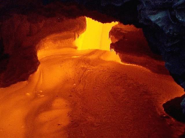
It's too bad Descent 3, by default, makes lava so bright. It would be nice to have more contrast in the lower caves (for example, bright on the lower areas of the walls, darker toward the ceiling).
Posted: Mon Jun 06, 2005 11:08 pm
by Slowguy
hmm, hey that's moddable.

The texture for lava is already modded to not set the players ship on fire... It wouldn't take much to make lighting adjustments. I agree that those lava tunnels would look a lot better if the lava wasn't so bright.
Posted: Mon Jun 06, 2005 11:13 pm
by Duper
Send me a new table Slow. I'll throw it in
Posted: Mon Apr 10, 2006 4:02 am
by Xamindar
Did this level ever get finished?
Posted: Mon Apr 10, 2006 7:34 pm
by Duper
No.
I handed it off to Slowguy who had worked the doors and the table files for the doors and the Lava (D3 lava is hideous on your shields)
It was outta scale and there were problems with it that were getting under my skin. I think I blew his mind when I quite literally dumped it on him. It's been a while, so I might be up to giving it another go. It's about 85% done.
Funny you should post this, I thought about the level just last friday. Yea.. I'll finish it. I have 2 long standing projects I have to put the final nails in.
Thanks for the prod! (sorry Slowguy!)

 Here are some screenshots. There will be some differences, like more tunnels and possibly different textures on the doors. They use the original D1 sound.


